This time I made a video of the problem for batch processing. This version of the software is very bad. It no longer retains settings from one image to the next. It systematically recalculates and loses the setting I gave it in favor of the automatic autopilot setting, which I deactivated in the preferences. I’m going back to 2.3.2.
Supporting video:
2 Likes
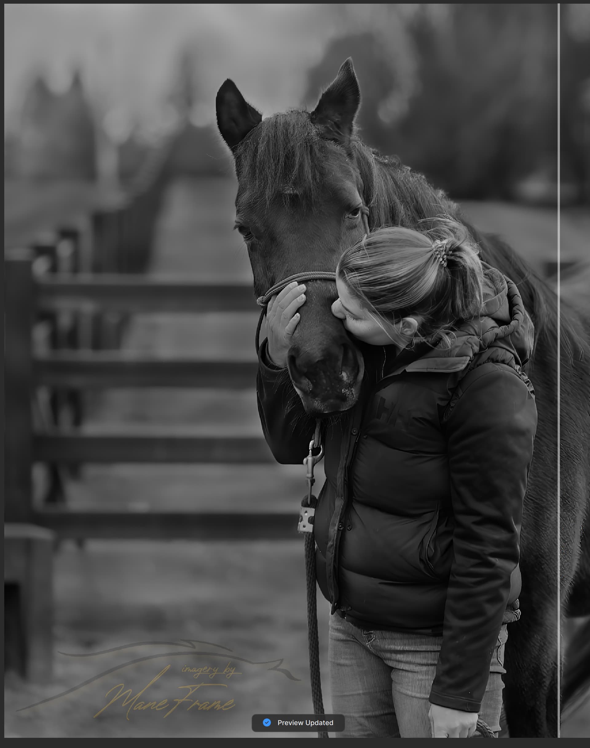
Absolute disaster! Sharpening distorts image so badly it becomes unusable, noise reduction creates unnatural striations in hair/fur.
Whatever you did, you need to undo it or give us instructions how to roll back to previous versions
Screenshots shown were with noise reduction set at 10% of autopilot recommendations, sharpening set at 1% of recommendations

1 Like
Hi, Overall 2.4.0 seems to be working for me, albeit a little slower in performance than the previous releases.
I have one issue to report ; ‘Select subject’ is not working - just defaults to a rectangle in the top left corner, even when the subject is very obvious - an airplane in the sky.
Regarding the usability, we tried a few designs but some of the features do not work with the “classic” interface that only allows a single instance of each enhancement. For simple edits that workflow was enough. This design is more versatile.
Was it easy to understand? Are there other barriers to using it aside from more clicks?
Thats a huge jump though. I load 175+ pictures in the timeline. It used to be 3 or 4 clicks max, now its 10 clicks to do the same thing. Thats 600+ more clicks. Not very usable.
You can design the options for the settings to not be in the floating UI. Just make it a part of the UI beneath the header. That keeps your functionality while reducing the amount of clicks.
2 Likes
Additionally, I’ve never had the program crash to desktop before no matter what I was asking it to do, but now I’ve had it happen twice while select the text areas for preservation. It appears to be very sensitive to moving too quickly from one area of text to the next. If I start drawing a new text area before the updating preview indicator finishes it crashes out.
Hello Lingyu,
I want to address my post directly to you, and your team, as well as all people on the forum who expressed their disagreement with latest PAI design, and ask their opinion regarding my proposal.
I also want to joint people who appreciate your fast respond, regarding UI issue, and your promise to addressed it as soon as you can.
-
Recently your Team awarded GP users, who stand by your product, with latest update. I was so pleased to see how great your new GP UI looks.
-
All your products, in fact, the same thing, and just have different assignments.
-
What if you use newly designed GP Interface as core base for all your programs, across your platform, and port different tools for each individual program.
-
It’s easier for you to manage, cost less to create, and for the users, who use them all, or some of them, no learning curve, as UI stays the same.
-
For example: you can port PAI Noise Reduction tool to GP, or anything you create in a future, easily at your will, if all programs use the same UI.
-
Here is a picture I created, for better visualization of that idea.

-
Left Panel has 15 Tabs. PAI has 8 ready to fill, the rest you can delete, and add one by one in a future, replacing name “ Additional Settings” with new Tool name.
-
Panel 2 and 3 it’s easy to compare side by side. GP clearly the winner.
-
Resize Mode: 1x, 2x, 4x, 6x individual buttons, and Custom scale sizes with 2 options.
Thank you -
8 AI Models, at least for now, with yellow colour switch and nice touch lightning sign - just great
-
Settings panel sliders in Yellow colour, for GP 7.02, but not for some reason for GP v7.03, and need to be added back please. Maybe Orange instead of Yellow, as it has better look on black
-
“Additional Settings” Tab needs to be rename to Face Recovery. Slider need its own blue colour, and add please missing Select / Deselect Faces button, as many people on the forum ask for that.
-
Radiant Photo Team, with their slogan: “ Made by Photographers for Photographers” made all their sliders in Orange colour. They know very well what photographers like.
-
Good Idea to make every Tool set frame slightly lighter, for better visibility, and visual separation from background, like original PAI UI, or even better to add some colour tint.
-
I like very much buttons in blue narrow frame, that looks so alive.
-
When I use all tools in GP, and all Tabs still open, they remember their open stage, after computer restart. No additional clicks needed. Thank you.
-
One thing I like very much in PAI 2.4. is a Progress Bar you place on the bottom of the developing picture. If possible, can you add that to GP and new PAI please.
-
I started again to use GP from v7, because of great UI .
-
Here is a picture of the Info Panel, that I need to bring your attention as well.
-
It’s so well designed, professional Info Panel that has to be part of PAI as well please.
-
If possible, can you place file name on the middle of the screen, align text to the center, vs placement at far left. It needs to be closer to the Info Panel, to have all information on the right side of the screen.
-
And last one, if possible, can you give an option to increase tex size, from Normal to Large or Extra Large. It can greatly benefit many photographers who are using Hi resolution displays and TVs, including me.
-
In 2022 I purchase Video AI, and after couple of days I discover and purchased GP, DeNoise and Sharpen AI, and was amazed how much these programs can help me in my photo editing work.
-
I switched my focus to photo editing, and never start to use VideoAI at all, but later that year I purchase 2-Years Updates, maximum what was available at that time, knowing I wont be using it for several years, but just to support great work of Topaz team.
-
Also at that time I purchase 3-Years Update for all 4 photo programs, that ends in June 2025.
-
This is shows how much I valued your great products, that is so useful in my photo editing workflow.
8 Likes
This please. This update was really bad for preserving texts. Until text issues are resolved, have to revert to previous version
Strongly urge Topaz team to address Preserve Text functionality issues asap
5 Likes
totally agree that the previous options display on the right was much better - now when you click on sharpen or denoise, the options dialogue partially covers the image on the screen, plus you’re having to click through to find the options where you can adjust what part of the subject was highlighted - I use that a lot and it’s now much more of a pain to use - this is a very retrograde step - is there a way for me to go back to the previous release?
2 Likes
Version 2.3.2. can be download from here; Topaz Photo AI v2.3.2
1 Like
I’m TRYING to like the interface. I’ve been putting things through for 2 days. So far, it’s not an improvement for ME, but I do denoise, sharpen, and occasionally upscan, so I’m not seeing any advantages so far. And I can’t figure out how to quickly flip my sharpening on and off to see how it’s working.
Feathering keeps defaulting to 100. Is there some way to have it stay at the value I set? The problem is with the feathering at 100, ALL my edges are very poor when I reduce it to 20-25. And I can’t find any way to get it to reset the selection and do it again at my settings.
Same problem with the brush size. It STILL refuses to use the value I set at the default until I change it.
Selections are requiring a lot more cleanup – see above.
Strength of controls, like Sharpening, seems much higher. Everything I adjust is significantly harsher looking (crunchy?) than previous versions.
2.4.0 is a lot faster, but the selections are really poor, so I spend a lot more time getting the selection “good”.
Is there a way I can have BOTH 2.3.2 and 2.4.0 available concurrently? ‘Cause otherwise, it looks like I’m going to have to go back to 2.3.2…
2 Likes
What confuses me most about this is that both enhancements and selection have a done button. So when I am done editing the selection and hit done it closes the feature. I would also like the addition of a cancel button. My suggestion is that the selection pane button is labled “Apply” and the enhancement have both a “Done” and “Cancel” buttons. Selecting the “Apply” selection button should return you to the enhancement pane.
2 Likes
in short for 2.4
++ masked / multiple denoise & sharpen great improvement
Still excellent denoise & sharpen itself
-
Sharpen now uses fixed selection only. which does not make sense when default subject detection is “none” (and no preference for All) so nothing happens until few mouse clicks to fix it. (every single time)
-
Would be nice to rescale the strength for lens / motion blur to allow for less strength, e.g. few steps below “1” which in many cases is already more then enough.
-
While in remove tool, panning (as per text at bottom) with space bar = same key to toggle before/after at same time.
-
Color / lightning adjustments still very slow, even with nothing else selected. Not on par with even simple free tools.
Like your comments overall and how you articulated them!
I’ve suggested this too and agree with your proposal.
1 Like
I don’t think there’s a way to have both concurrently. I’ve reverted to 2.3.2… it just works.
@Lingyu I created a video of the masking brush not working until changing from superpixel to something else, but upload doesn’t like mpg files. Let me know if you want it.
You can CANCEL the enhancement by deleting it with trash can icon.
1 Like
I love the new interface. It lets me stack as many enhancements as I want… Select sharpen, mask an area/object, click done. Select Sharpen again, mask a different area/object, click done… same with Denoise…
2 Likes
But if I opened an adjustment to make changes to the mask or try a different model, I don’t want to start over if I decide the changes don’t make it better.