Photo AI 2.4: New Workflow and Design (March 2024)

We are excited to share a huge update to Topaz Photo AI, version 2.4.0. Release thread here.

Here is a workflow tutorial on editing in this new workflow:
Photo AI 2.4 Quick Start

In the last few months we gathered feedback on Topaz Photo AI through our support channels, forums, and numerous user interviews. Thanks to all of you who have graciously shared your time to participate. We identified many areas for improvement and set four goals to improve the application:

  1. Make it easier to use
  2. Increase user control over processing
  3. Improve speed of processing and editing
  4. Create room for new tools including generative AI like Remove

We explored many solutions, tested, refined, and selected the best to build. The new design includes several big changes.

A new workflow

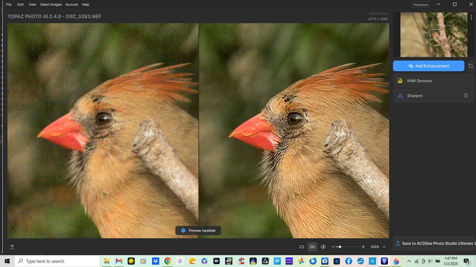
Image processing is the core of our application. We separated the tools and allowed them to run in any order, to put you in control. Now, it’s much easier to see how your image is improved step by step, and we hope this transparency leads to more creative outcomes.

Workflow

You can start editing a photo by adding just the enhancements you want -OR- run autopilot to analyze your image and start with our recommendations. Either way, you can edit, add, and remove enhancements as you go.

Control the processed area for each enhancement.

You decide which parts of the image are processed. The new design allows you to select which areas of the image are processed by each enhancement.

Selection

Some examples of how you can use the new selection feature is adjusting the color balance of your subject, or selectively denoising only the background. The theme of this release is putting more control in your hands to shape images the way you want.

Goodbye to toggles, hello stacked enhancements.

Now you can use as many enhancements on your image as you want.

For example, you can sharpen your subject and background with separate enhancements to be able to control the effect individually. We hope this unlocks new creative freedom and we can’t wait to see what y’all make!

Selection

There are a few exceptions to this feature but we will continue to work on enabling the flexibility of stacking enhancements in future releases.

Customizable interface

We’re just taking our first steps toward customization in this release. You can now drag the enhancement panels out and place them where they work best for you. The team is working hard on more interface organization features and you can expect to see greater flexibility in future releases.

Draggable

We’ve revamped how filters are processed to make Photo AI more responsive.

Creating a flexible processing order allowed us to dramatically improve the efficiency of processing:

  • Preview updates faster when new edits are added
  • Switching between your current edit and previous edits is much faster
  • Background processing is enabled for computers with 24GB or more RAM when preview is updated (processor is not idle)

All this means editing your image feels faster compared to previous versions.

Crop it like it’s hot!

We know it’s been a long time coming. We’ve overhauled our crop tool to make it more responsive and added critical features like straightening. We’ve also fixed quite a few bugs. The new crop tool loads and saves much faster, and no longer runs Autopilot after for a snappy experience.

Crop Straighten

The Remove tool can now be used like other filters.

In the new workflow, you can use Remove at any point. It will lock previous edits, which is necessary to maintain consistent output from our generative AI. But other edits can be added after so it does not disrupt your image processing.

We updated the controls so they are easier to use. Remove can also be easily edited or deleted from the stack.

Remove

What’s next

We are committed to adding new features which will reshape your favorite enhancing tool. Some of the most important work we’re doing:

  • Adding new tools and enhancements
  • Enabling more flexibility in how enhancements work
  • New customization features
  • Improving processing performance
14 Likes

I would add one thing
 The forum admins should make this a “mandatory read” before any users are allowed to post in the Photo AI threads
 :grinning:

8 Likes

Now I’m just saying, why did you do this?
Why spoil a good interface with what I consider to be a bad interface? The program is no longer easy to use at all.
What I find very difficult is that many more things now have to be done and are gone immediately and it is not easy to switch on and off, or switch between different modes to quickly see the differences. I don’t understand why an interface that works well needs to be adjusted while the program needs a lot of improvements to be adjusted in other areas.
For example, it would be very attractive if it had dust and scratch recognition. I use this program a lot to enhance scanned photos and slides, and I notice that these dots and lines are also very present after sharpening.

11 Likes

First, I am not a professional photographer so I’m only looking at my photos as a novice. I am a nature photographer and enjoy shooting birds. They are always moving. The Photo AI 2.4.0 update did a nice job on my female cardinal. I had been having trouble with Auto Pilot in the previous update to Photo AI, but this seems to be a very helpful update!

1 Like

And reading the release notes.

2 Likes

Add denoise a second time with the normal model (very weak settings) and remove sharpen.

I will try your suggestions. Thank you.

I reverted back to 2.3.2 to regain useability.

When I use the software in all other versions, I enable/disable and fine tune so many enhancements to test how each change impacts the image, I can never really be sure how it will look until I see it and adjust it. I can’t do that with the new UI - either the settings are hidden or the right of photo is. Such an odd UI decision. The new updated UI gives me windows 11 vibes - the hiding of basic features behind extra clicks is really frustrating. (Windows NEW right click menu anyone?)

I’m hopeful the interface matures and becomes more user friendly again in the next update.
I will definitely not be a happy camper If I end up losing out on new features I paid for because the new version makes the workflow much harder for me.

10 Likes

Estoy de acuerdo, encuentro mĂĄs Ăștil la interface de la anterior versiĂłn, supongo que serĂĄ cuestiĂłn de acostumbrarnos a esta.

I agree too. Or at least be able to toggle each of the effects once stacked. Also, this new version has crashed (exited without warning) almost a dozen times in the last half hour of playing with it.

2 Likes

Wow
 This new interface sucks


2 Likes

Please add on/off toggles to each effect so we can instantly do before/after comparisons of each adjustment, like in the previous interface.

4 Likes

I really liked the interface before 2.4. Also the latest update/interface has really slowed the processing as well. Not very happy with the “New Direction for 2024” !!!

3 Likes

sorry i dont speak Spannisch
if i use google translate you are talking about the costs of the interface?

1 Like

He is in agreement.

Not literal, but still valid:
“I agree, I find the UI in previous versions more useful, (but) I suppose it’s a matter of getting used to this one”

Obviosuly you don’t do English that well either if you think the word Spanish is written like you did, and I doubt Google translate would provide that way of writing it if you checked.

Don’t know what the forum rules are for language, but seeming as Spanish is one of the three (or four depending on how you count - Hindi is also up there together with English and Mandarin) most spoken languages in the world I prefer to believe it’s you not knowing how to spell it rather than it having been an ignorant way of making fun of it, just saying
 :innocent:

BTW - did you really use Google translate on that comment? Maybe we’re not spelling Google the same way either, but there is no mention of “cost” when I look that post up. It actually provided a very good translation of what was said (better than mine):


(I also translated into Swedish, Norwegian, Danish and Catalan as well for reference, and they all provided a rather good translation of that post)

Now if you’d try to translate to/from Finnish I’d understand, because all the Finns I know are in agreement when it comes to how well Google does with their language
 :rofl: Spanish on the other hand is usually quite “spot on”.

2 Likes

So, in the previous workflow preserve text worked perfectly. Now with the new workflow it seems completely broken 
 text, even if highlighted, is no longer recognized and turns into strange shapes.

To me the result on the plumage of the bird looks over sharpen and a bit artificial looking. Personally I would want either more realistic results or reduce opacity of the effect it got you to something less aggressive. If I’m not mistaken I think Gigapixel in some AI models would provide us with better results of feathers than this, so it feels a bit disappointing, like its a step backwards from Topaz.

2 Likes

I think you are being unnecessarily harsh toward pascal.vreuls, particularly when you make fun of the way he spelled “Spanish.” As soon as I saw “Spannisch” I thought to myself, "That’s awfully close to ‘Spanisch’ which is German (for Spanish, of course!). With a name like Pascal Vreuls, he is likely not to be a native English speaker, which means we should cut him more than a little slack! ¡Ojalá que cuando escribo en castellano, los nativos no me burlen!

3 Likes

@Lingyu What I always miss a lot is a sharpening depending on the blur. At the moment, sharp areas are often over-sharpened. It would be nice if sharp areas were only slightly sharpened and unsharp areas were sharpened more. Could you add this to the wish list?

2 Likes