It might be time to have 2 versions of Photo Ai. A slim version with just the up-scaling, noise reduction, and sharpening included. These would have the best versions that the developers have engineered. The second with the above plus the other enhancements that would require the newer interface to be efficient.
3 Likes
![]()
Well, I must applaud that fact that you are clearly a creative person! ![]()
Even if statistics are not that malleable. There’s a great book I had to read when I was doing tech mktg and strategic planning. It was called “How to Lie with Statistics”. As a marketer, it also offered creative ways to present positioning with statistics that were handy at the time!
https://www.amazon.com/s?k=lying+with+statistics
Your note made me smile! Ah, nostalgia…
11 Likes

Yes that makes perfect sense
It is very odd how individual results can vary at such a large scale in 2.4. I grabbed a random poor image (jpg - cropped), nothing was done for enhancement other than through TPAI. I imported the image through PS CS5.
I spent maybe 2-3 minutes on the process.
Denoise all
Sharpen subject
Second layer, addition sharpen on the beak and feet.
For quick processing how is the result so vastly different from what others achieve. Overall this image could be improved with a little more time, color correction and some adjustments with range but it’s a very passable image.

I may have misunderstood… Are you suggesting that in order to have the ability to do the new feature of masking for each of the primary PAI functions (denoising, sharpening) as well as the already inherent PAI functions (face recovery, text preservation, scaling, exposure & color comp) we’d need to have a diff. interface that requires that new functionality be segregated into separate boxes that require more clicks to open/close & that overlay onto one’s image in the workspace?
I ask b/c in my Ps interface (which is where I run PAI as a plugin) I have a righthand column setup … my layers appear on the top portion of that righthand column and my settings/adjustments/enhancements (whatever someone calls them) are in the lower portion of the righthand panel. Never the twain meet, they are never out into the workspace on my image(s) either.
Ditto for Adobe Camera Raw - righthand panels I use pretty much daily are ‘permanently’ expanded for easy access to show settings sliders, the panels I use less often I’ve moved to the bottom of the righthand column stack and I keep them collapsed unless specifically needed. There, too, they are never overlaid on my images in the ACR workspace.
The design of the interfaces for Ps & ACR are such that if users prefer to keep all panels collapsed until used, or some open/some collapsed or wanna drag some panels out over areas of the workspace they can do so if that doesn’t bug them to have them on top of their images (or if they don’t mind working w/small images that are off to the side of the workspace).
To me, the basic ‘interface’ (layout flexibility if you will) is different than feature richness, performance of the features and image processing speed attributes of the product. But it heavily influences my (& I have to assume others’ too) product usage experience (or, lack thereof) of the features that ride on the interface.
I’ve used Topaz products for over 12 yrs. “Legacy” products used to have an “Apply” button that let users accept a series of settings (it was essentially a layers approach w/out physical layers). Users could build upon settings incrementally without having to end the session or exit the interface then come back in. I don’t remember those products having segregated boxes of settings that couldn’t be left expanded (if desired) & none of the settings covered images in the interface’s workspace for images. All the settings were in the righthand column/panel and could be expanded and left visible/expanded (or, not - to personal taste). We used a scrollbar to scroll down if necessary - which didn’t bother me at all b/c I could just roll the wheel on my mouse and it was quick to work with b/c frequently used settings were visible and easily accessible w/out clicking open/close buttons or boxes.
I believe someone else wrote in above to comment on the difficulty they perceived (as a software designer themselves) of maintaining multiple interface designs. I take their word for it. I’m not a programmer.
If the current product is somehow bifurcated feature-wise and has different interface designs too (I thought those are what you proposed), it somehow feels as if a lot of customers/users who adopted PAI for its features set would become disenfranchised. But it’s possible I may have misunderstood.
2 Likes
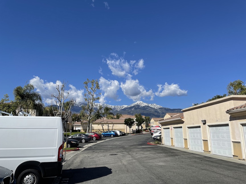
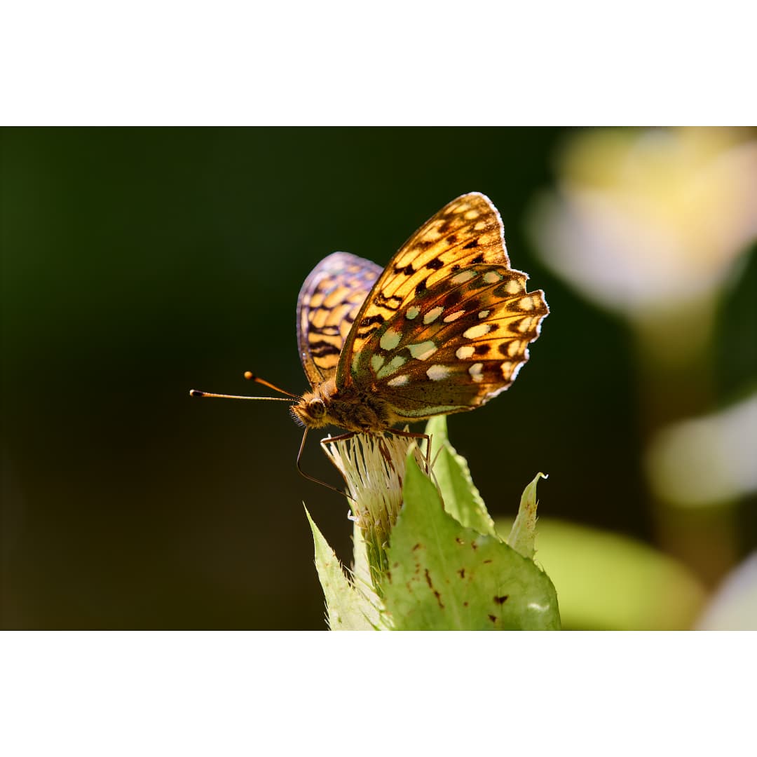
Today’s artsy:
Using Photo AI to radically enhance a purposely left wide iPhone scenic, shot today in SoCal.
Here is the full frame, reduced:
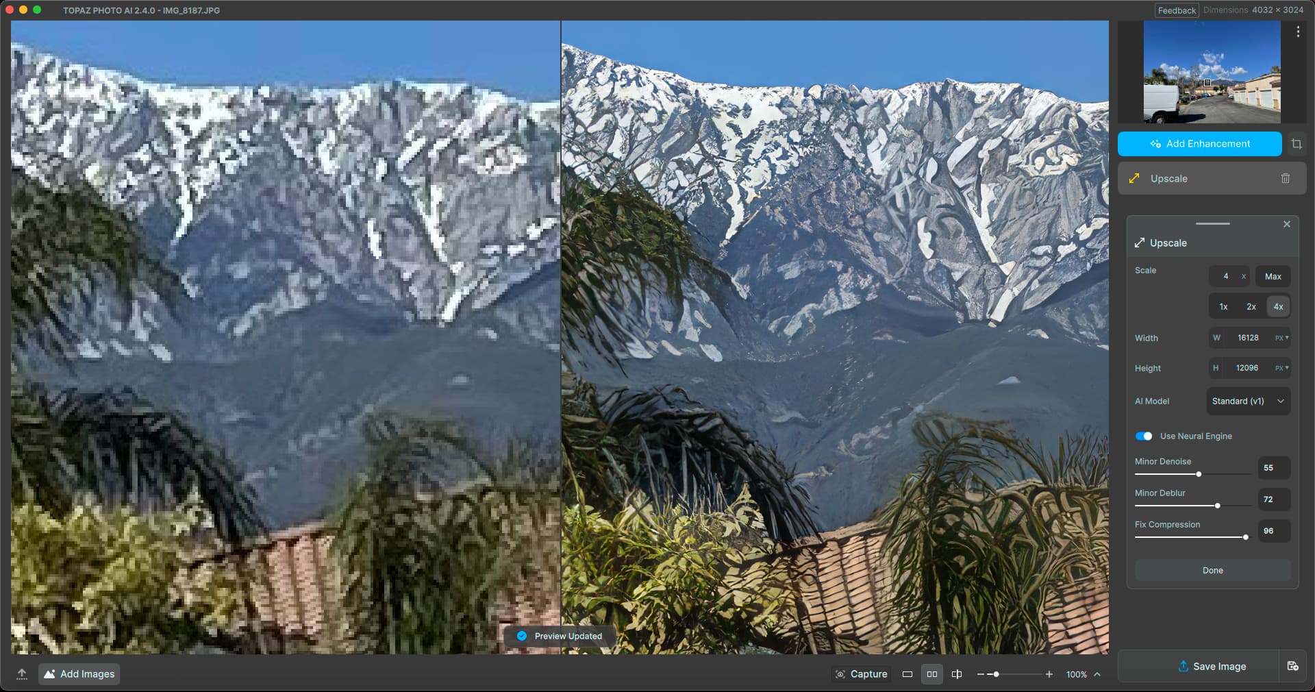
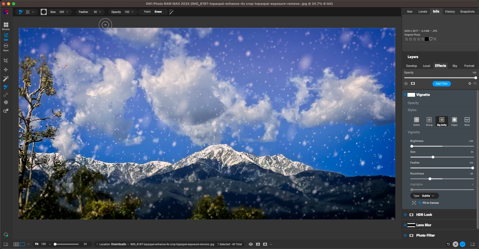
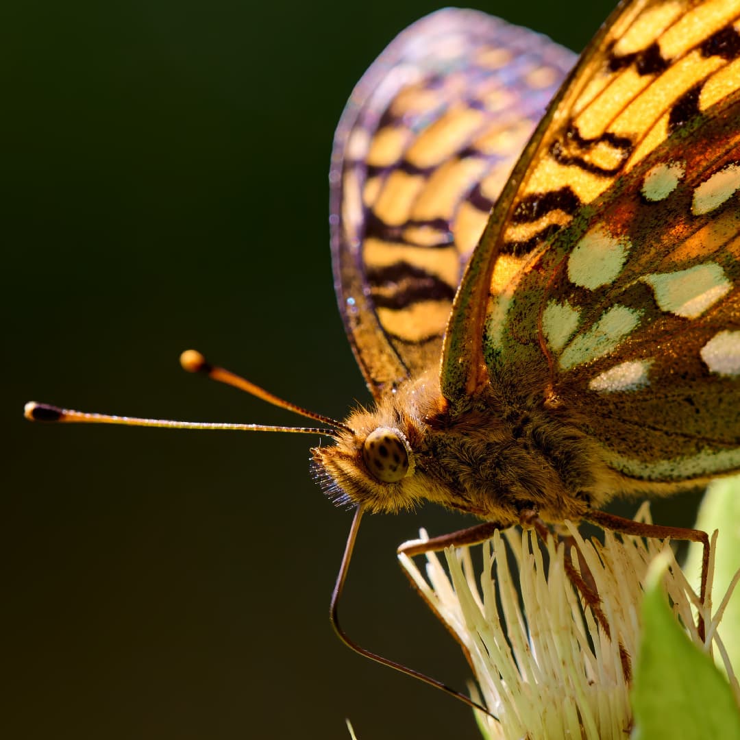
Upscaling 4X in PAI. I noticed today that the floating panel can now be dragged over into the right panel where it stays! Image was saved at this point:
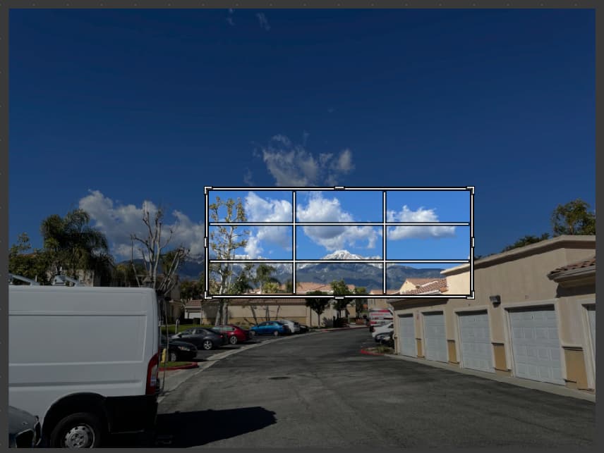
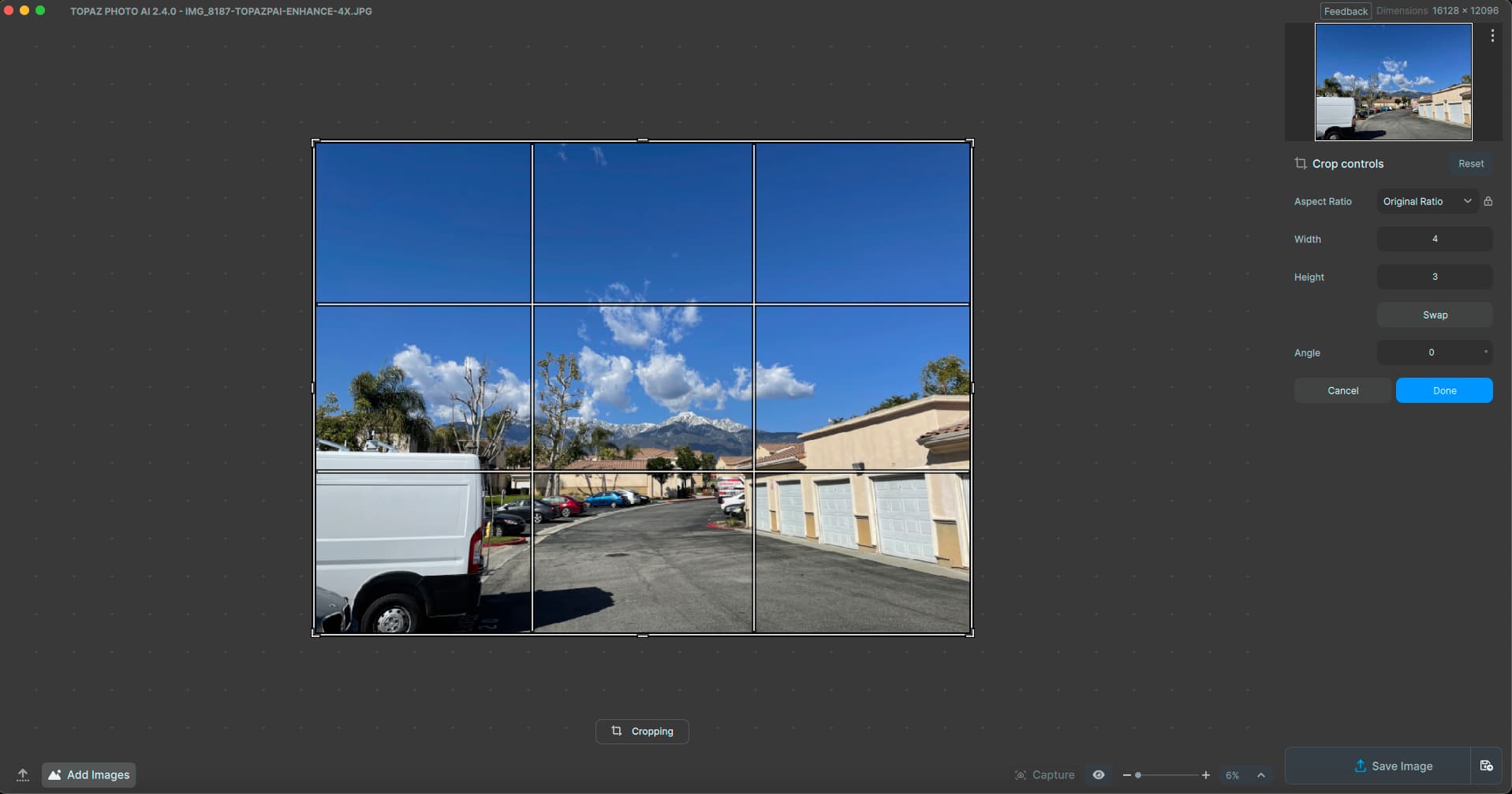
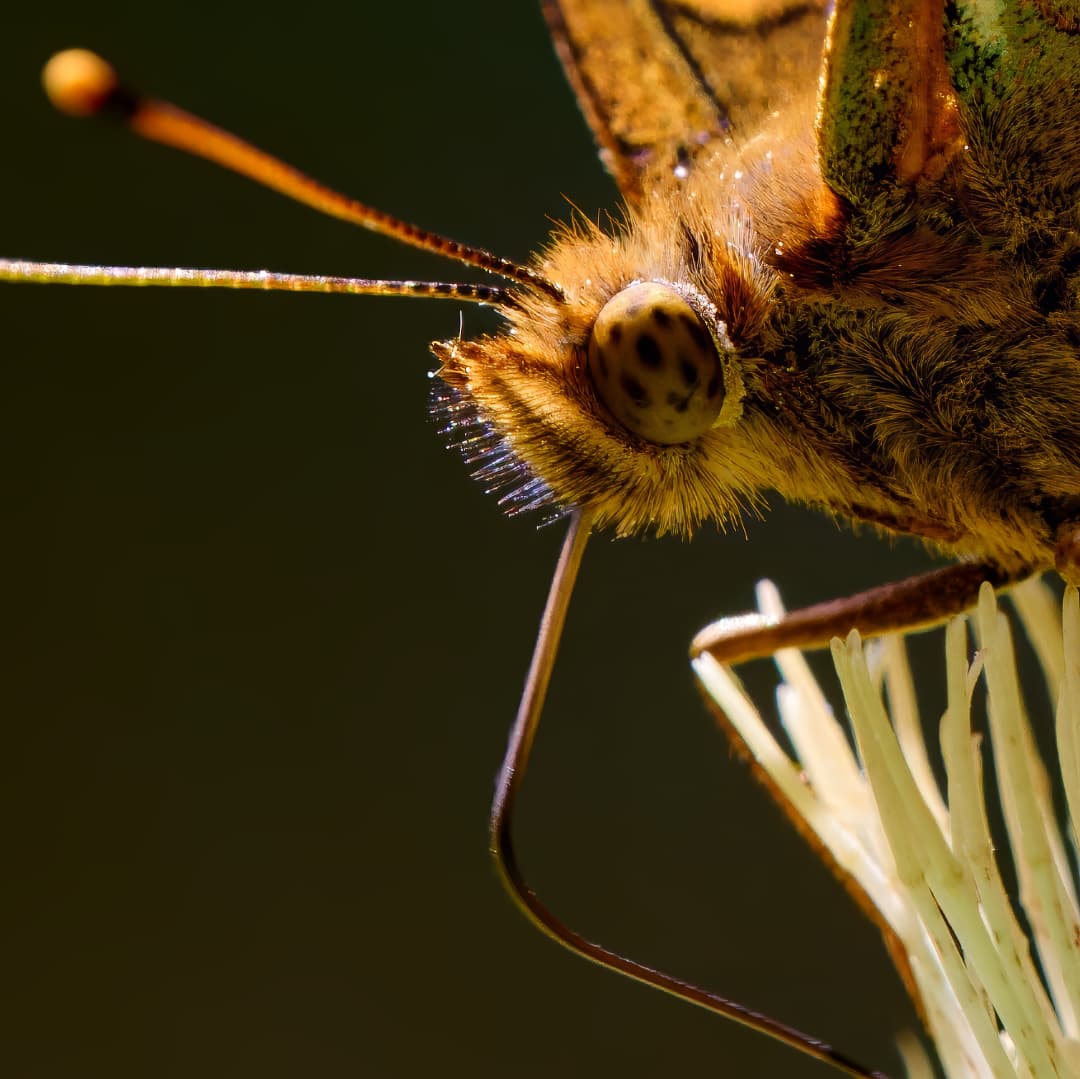
Reopened in PAI to do some cropping in preparation for further Enhancements:
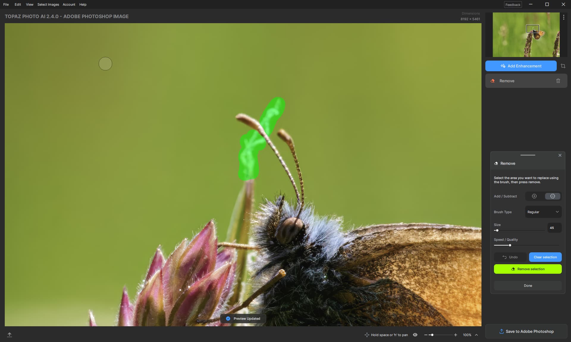
Now to do some Removing. But where did my crop go?? Remove is choking on the full 4X image (M2 Mac Mini, 500/16):
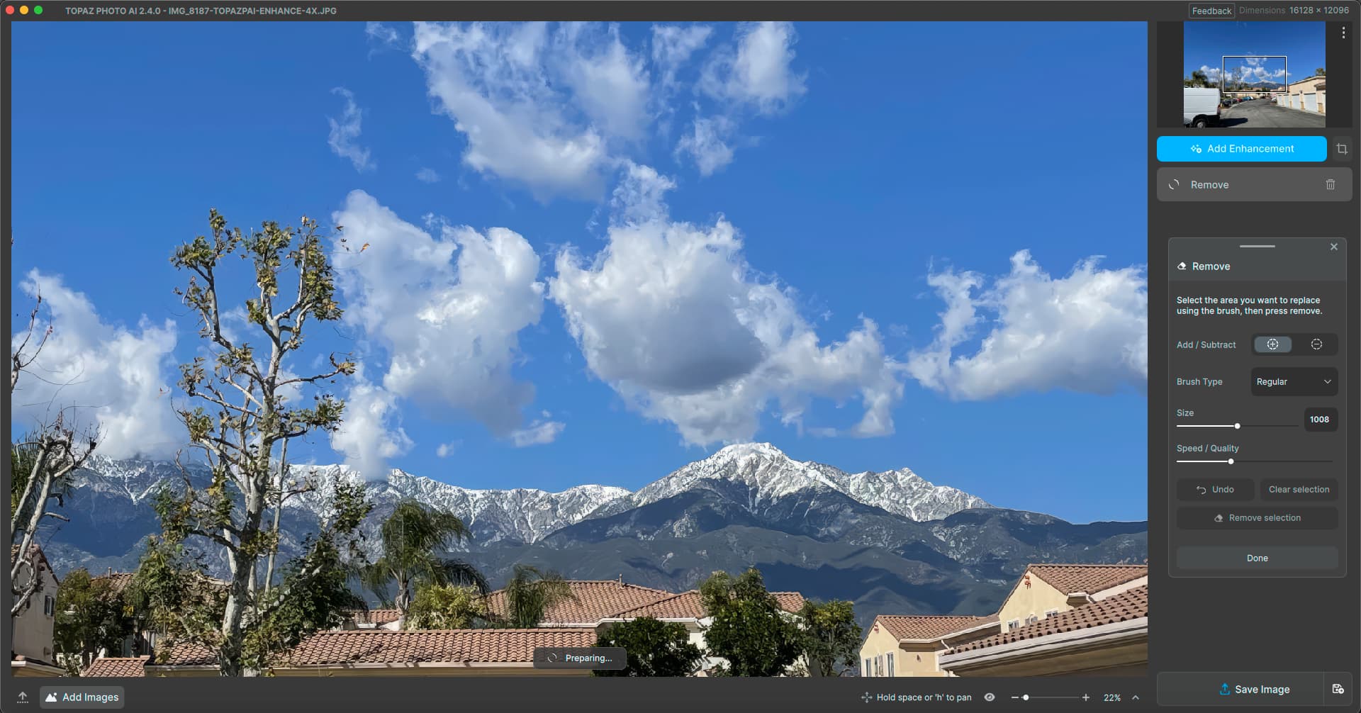
Revisited Crop, there is no crop…
After removing Remove and recropping, Remove came back on its own…
I removed Remove again and tried other options; crop was retained – until I tried to Remove again!
So I’m forced to use Photoshop to do the crop… Maybe PS can be a PAI plug-in, ha!
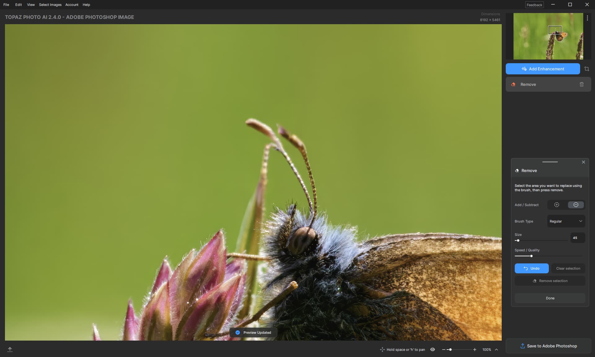
Back into PAI with the PS cropped image to do Removing. Got yelled at by PAI, maybe I was getting greedy?
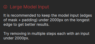
I’m also finding it difficult to do Removing near the edge of the image (the brush disappears and stops working).
That “Clear Selection” button really needs a rename, it is confusing next to “Remove Selection”.
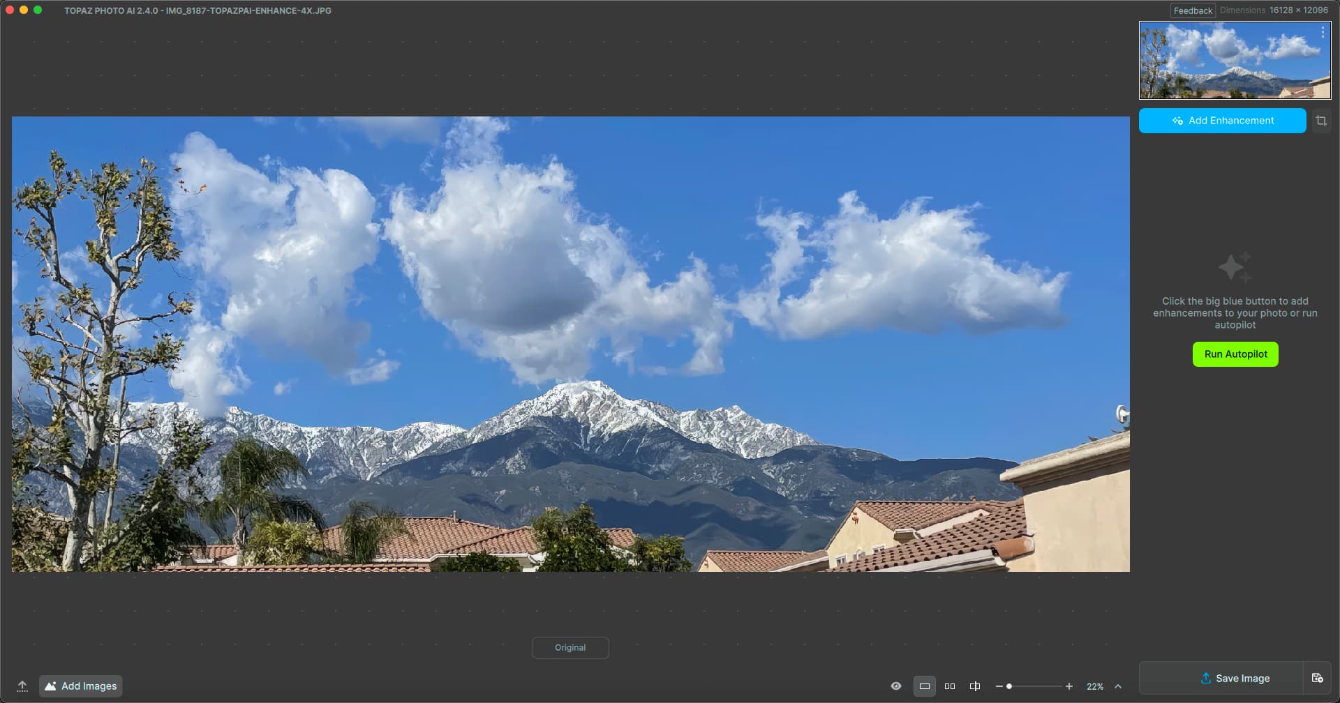
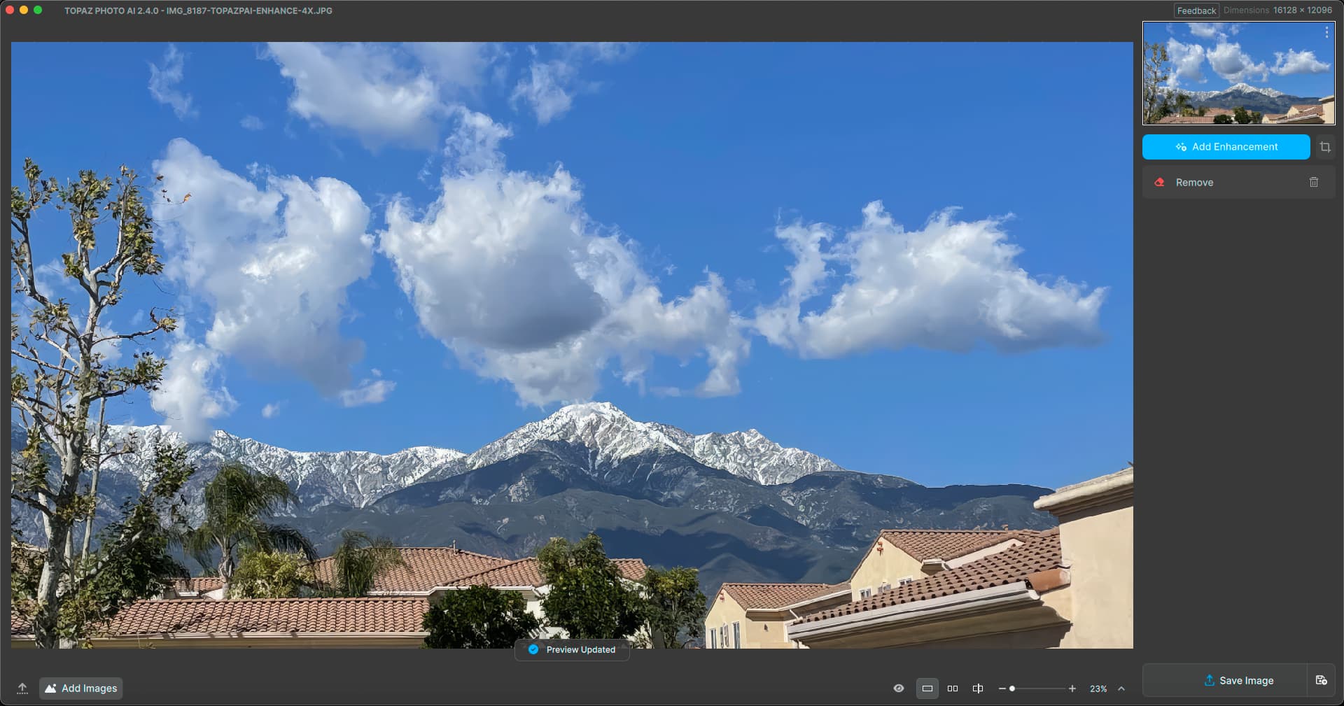
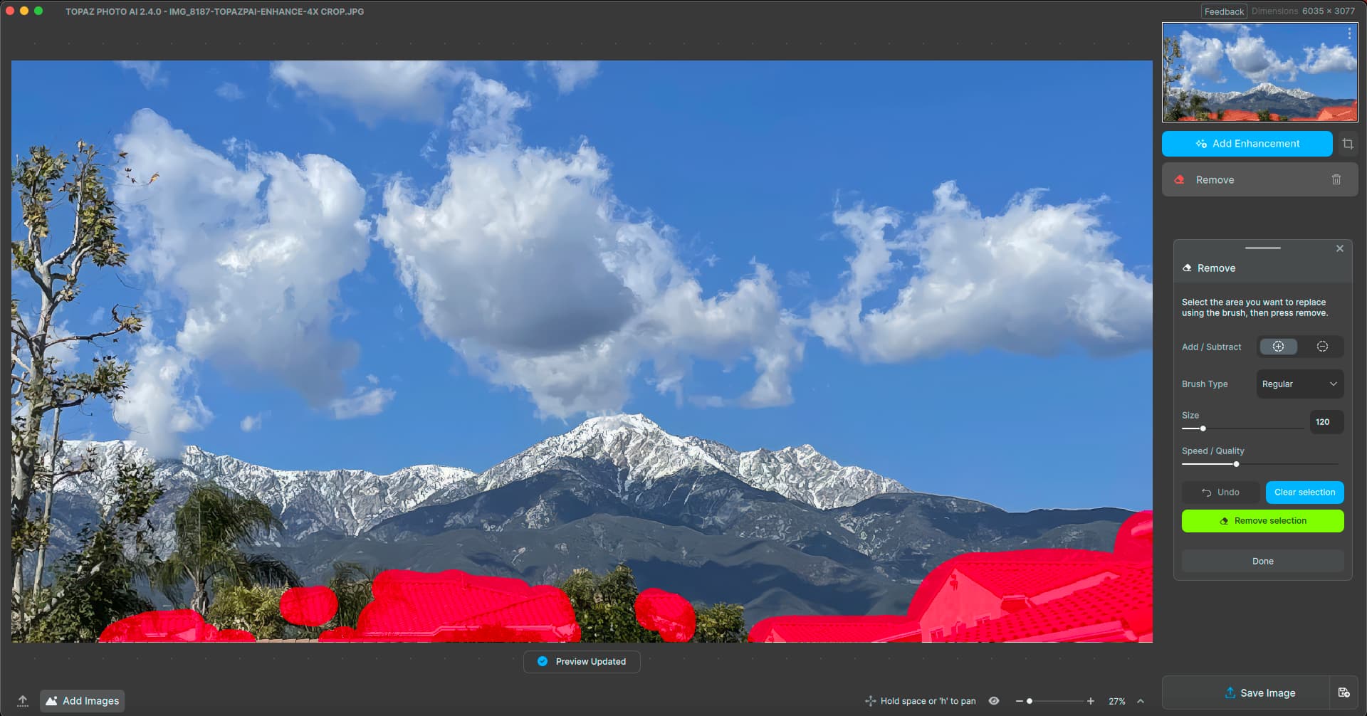
First pass is decent:
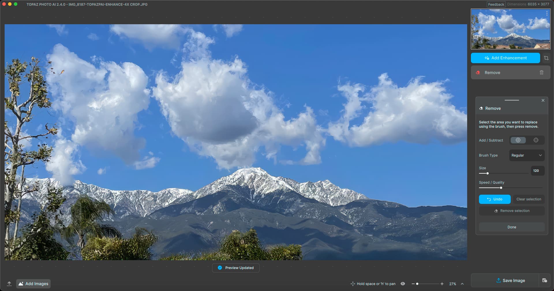
Some further touchup Removal, then about all you can still do in PAI in terms of anything resembling creative post-processing is some Lighting adjustment:
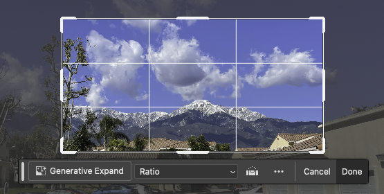
To further “realize my vision” for this extreme enhancement I need to turn to other apps such as Photo RAW, whereas Topaz Studio used to offer such creative options. The “Add Filter” button in Photo RAW seems to be an inspiration for PAI’s “Add Enhancement”. Also note the nice scrollable, tabbed and expandable right panel stack…
3 Likes
I will take your applaud as an award, thank you. ![]()
1 Like
It is!
1 Like
Have they made bets on who will notice first?
Is that included in the documentation?
If so, I will be ashamed of myself for an hour.
I had actually tried that before in an earlier build (and failed) but something made me try again today.
Of course it won’t stay there forever, and eventually pops back out again after you try different things. But this is good news as a solution to get the panel off the image and out of the way.
2 Likes
I would like to make the point that Photo AI has not reached the point where it needs such a drastic UI revamp, you don’t have that many tools/enhancements yet to need it. To keep users happy you need to give them some control of the UI, take Photoshop Elements you have 3 interface options, Quick, Guided and Advanced they all access the same tools and enhancements but in 3 very different ways.
Another point is whoever is designing the UI obviously has no or little experience using photo manipulation software in that you need to be aware of how the image is being affected at every stage as seamlessly as possible because otherwise things get slowed down exponentially causing massive amounts of frustration.
12 Likes
Old but Gold.
DxO Deep Prime XD → Capture One → TPAI Resize 2x → Photoshop (Color).
1DX, EF 180mm (+2x TC), ISO 800, f/8, 1/640 sec. ← on ebay you get this combi for less than 1000€.
2 Likes

5 Likes
I do not normally batch process in any big way but, since others are reporting memory issues, I thought I’d run 300+ images (mostly ARW, but some HEIC, JPG and DNG) through autopilot. After several minutes my computer was out of application memory and PAI quit.
Mac mini M1, 16GB, Sonoma 14.4
2024-03-09-13-52-20.tzlog (1.5 MB)
2024-03-09-14-24-40.tzlog (35.3 KB)
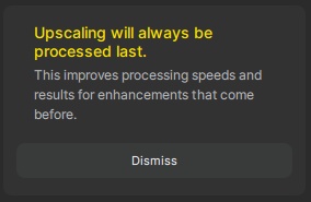
Can we please do away with this? It maybe served a purpose the first time or two, but not every time we use the program. On the scale of how badly you screwed up the new user interface, this shouldn’t seem like so much, but it is really getting annoying.
5 Likes
2.4.0 Selection pannels need to be away from the
Photo not covering it up.
3 Likes
I downloaded 2.32 and appreciate Lingyu’s suggestion. I hope there will be a comprehensive update iff there is a better alternative to 2.40 as it now stands.
Good luck.
Great Product till 2.32
Paul
1 Like
Took me a a while to think about it too, gto Grab them and slice them over like any other window.
Also being able to save and load choices as a present would be nice.
1 Like