Gigapixel v8.3.4

Oddly enough, there is a similar structure present even in the original video still. But yes, even at creativity 2 one has to be careful as to where the things prompted appear in the picture. :smile:

Your workflow sure is superior in avoiding such artefacts but, admittedly, that would be too much of a hassle for me. If I run into an artefact I cannot get rid of with the GPAI settings I want to use, I’d most likely stuff the result into Stable Diffusion and let it do the job for me.

For stable diffusion, it’s an idea. But there are too many parameters to set up.

Are you saying to use Redefine at 1x, export the image, open that up and then do another Redefine at something larger (2x, 4x, 6x)? I just want to be clear what you are suggesting and the steps involved. Thank you.

Yes, I’ve noticed that Redefine doesn’t work very well on very high resolution images. Either there’s barely any difference. Or nothing at all. Even when scaled to a higher resolution. What works best is redefinition, firstly at 1:1 scale, but when the image is at a smaller size or at least 4K. There, it does the job very well. Then export. If there are artefacts, make a variant with a prompt describing the scenery. And not the main subject. Export this variant again. Then assemble the 2 variants in Photoshop or similar photo editing software. Then send the final image back to Gigapixel. It’s not always necessary to use Redefine again. You need to test this depending on the image. Sometimes scaling with Recover (V1 or V2 depending on the image) or Hight Fidelity or Low Resolution v2 will suffice.

1 Like

I have a similar experience.

That’s as good as it gets. Redefine works best on images up to 4K. Beyond this resolution, it has more difficulty redefining micro-details.

Fur: ​​At the request of my cat, I made a brief attempt to generate his fur and wrote down the result. The original photo was not worth much. I cropped it a little (on the outer sides) and tried various functions in TPAI (latest version) – the results were very unsatisfactory (the photo was poorly focused, instead of concentrating on focusing I watched and admired the cat’s climbing skills).

So I tried my proven method using Gigapixel (latest version). First I reduced the photo size, then submitted it to Gigapixel. Redefine with C=2 and T=3, Upscale 4x. Just a simple procedure. I tried it with and without a simple prompt (“A ginger cat on a set of steps attached to the wall. The cat carefully descends.”). The steps and observation deck are created for the cat, he sometimes likes to have an overview of the situation. I came up with the prompt myself, without the help of AI :slightly_smiling_face:.

For illustration, I attach a printscreen of Gigapixel and a cutout of the result for comparing the fur. Redefine created a beautiful fur, I could compare it with the real one on the cat, which is currently covering the monitor on my desk and trying to tap the keyboard with its paw. I think the fur with the prompt is a little better (without the prompt, the fur is rather rough; the cat has very soft fur). Without the prompt, for example, the inside of the cat’s ear was wrong – it is actually very hairy (which is shown by the version with the prompt). Moreover, it seems to me that without the prompt, there is something like an eye in the ear (with the prompt, it looks realistic, no eye). The color of the wall (in reality, it is white) is worth paying attention to. Without the prompt, the wall is grayish, with the prompt it is much better (maybe the mention of the color “ginger” about the cat’s fur played a role in some way?). Well, just a case study:

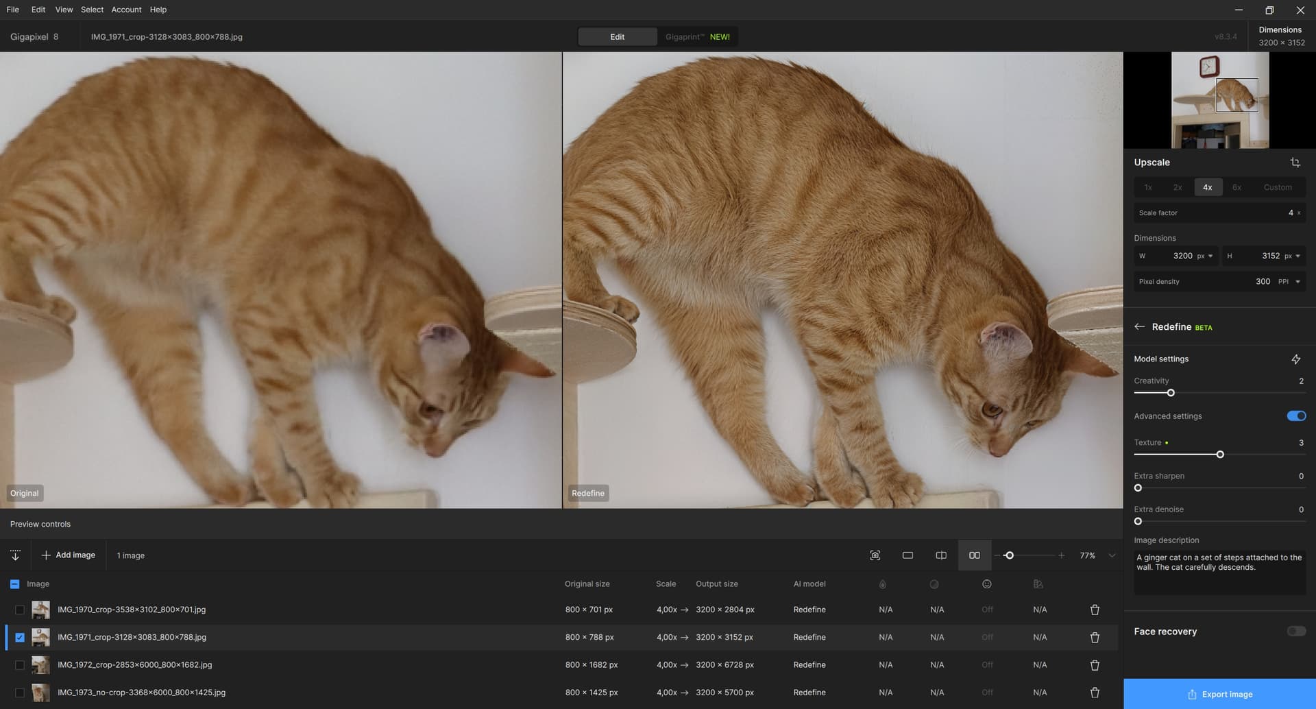
Reference Images and rendering variations with Redefine Settings

WARNING - A LONG POST WITH MANY IMAGES

This experiment was inspired by bas.evers and others

I agree with bas.evers ! I definitely like to test repeatedly in a similar way with one of “my” regular reference images. It makes it easier to compare both different Model Settings and different versions of the software. Building up a comprehensive memory of the same image helps to quickly spot differences between two or more renders. Hypothetically say there are 2 horses in an old historic print - perhaps with one version of Gigapixel you notice that for Creativity 1-2-3 they have 8 legs but with Creativity 4 they have 9 legs and perhaps with Creativity 6 they turn into 4 human figures with 7 or 8 legs. When a newer version of Gigapixel is released you have an immediate point of comparison by using that same old print image with 2 horses to check how many legs the new release renders. If you start testing the new release with a photo of chickens what do you compare the results with ?

So I’ve added Julia Roberts to my standard image refence set! She is also easier on the eye than horses or chicken feathers ! And I never noticed her birthmark which now becomes a very useful “check point”.

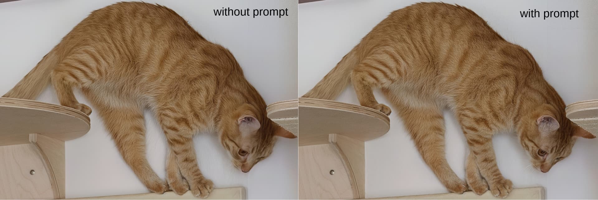
Recently I have been investigating the use of text Prompts when using Redefine. In this post I will show examples of both Model Settings and Text Prompts. The Devil is in the detail - so inevitably there are a lot of renders to look at. If you are easily bored please don’t complain - just jump to the next post and stay cool.

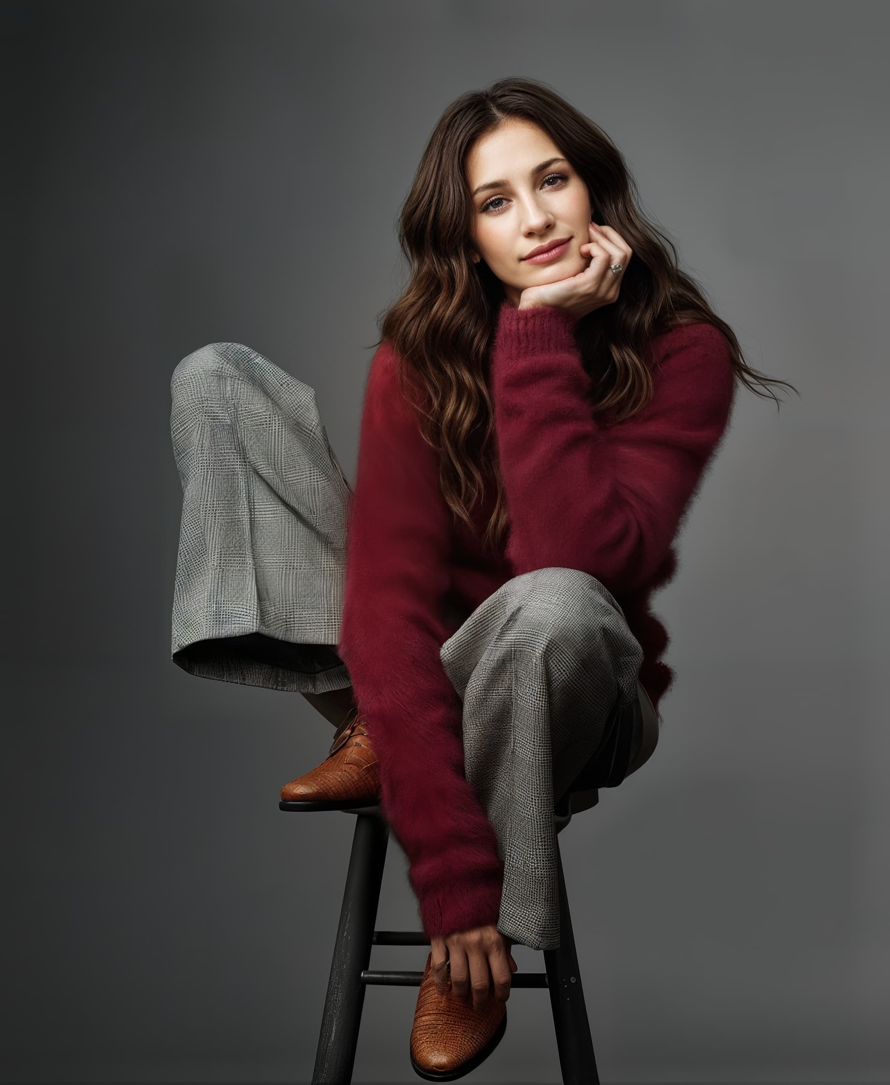
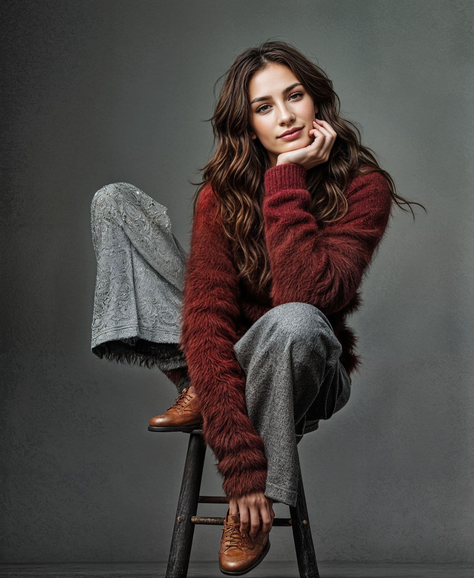
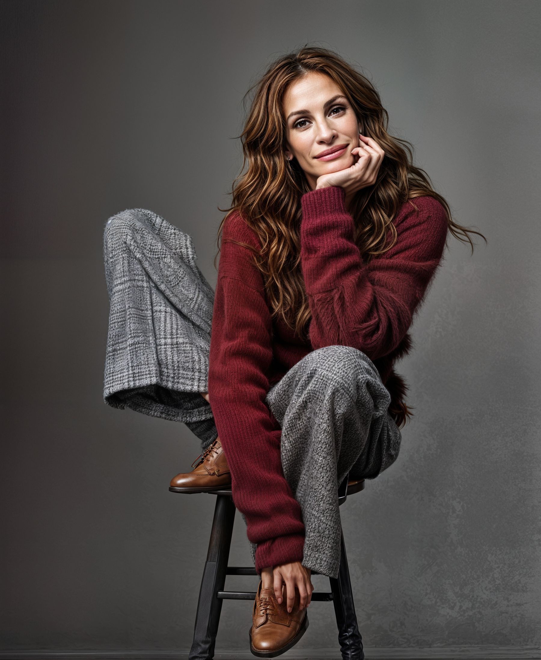
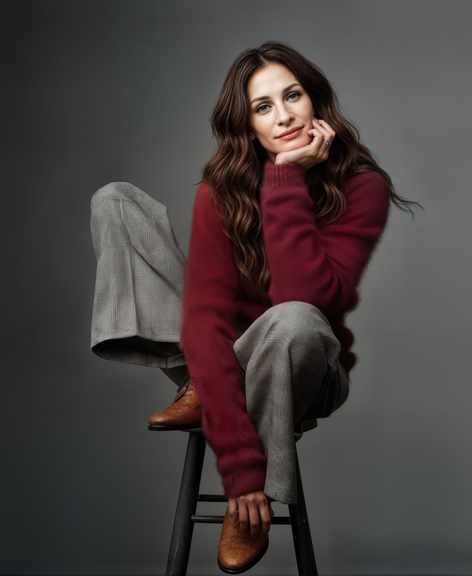
Starting test image is borrowed from Bas. 900x1097px jpg - note the brown shoe detail


.
.
The first three sets of renders are upscaled by 2x with a few 3x at the end together with 2 Cloud .

Currently I’m using a 4 digit code for v8.3.4 such as C4321 - this means:
Creativity 4
Texture 3
Extra sharpen 2
Extra denoise 1
v8.3.4 offers Text Prompting for Creativity 2-6

(In comparison v8.4.0-beta4 uses 6 levels for Creativity with different names and effect?
Realistic None & Subtle and Artistic Low Medium High & Max
plus only Artistic has Text Prompting)

The first set of Redefine images uses different values for Creativity and Texture with no prompts.
(Each filename includes the settings code described above and render time by stopwatch.
The times may seem random but depend on whether Gigapixel adjusts (quicker) or recomputes (slower) after setting changes)

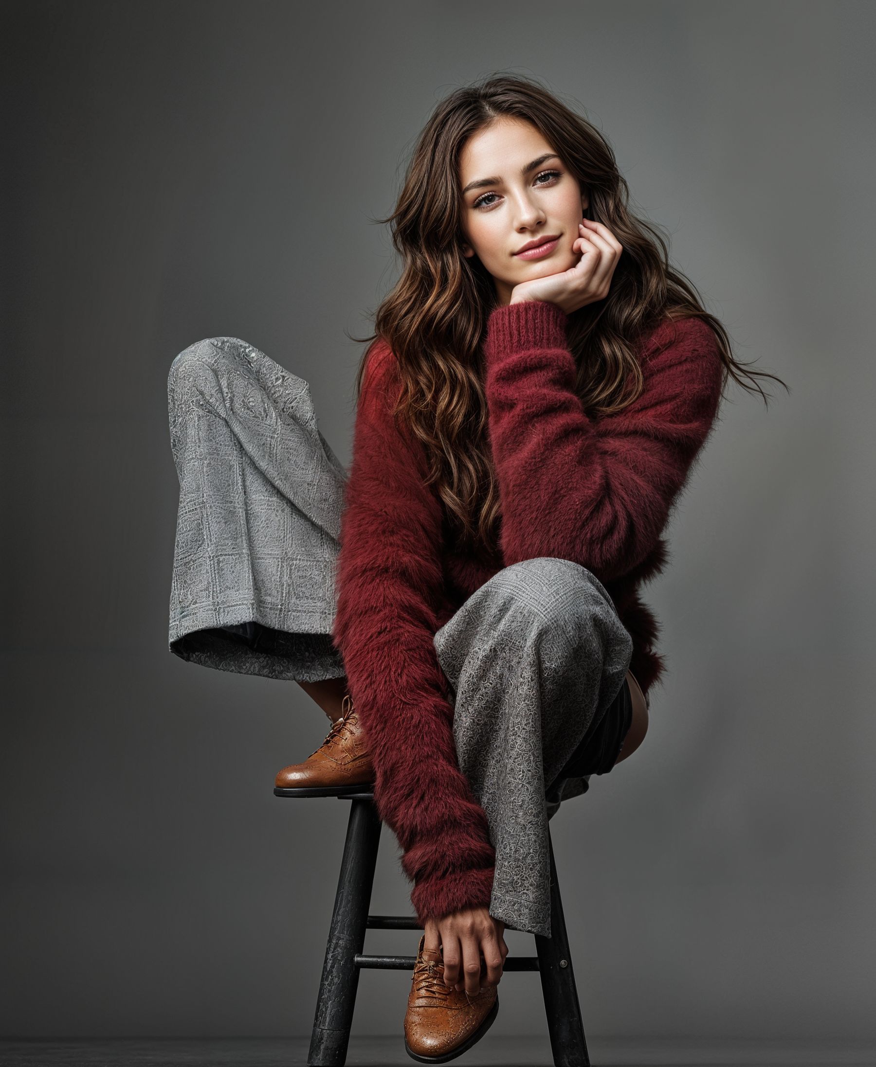
C1100 result looks like Julia Roberts - but already shoes are changed to Californian Artisan ?


.
.
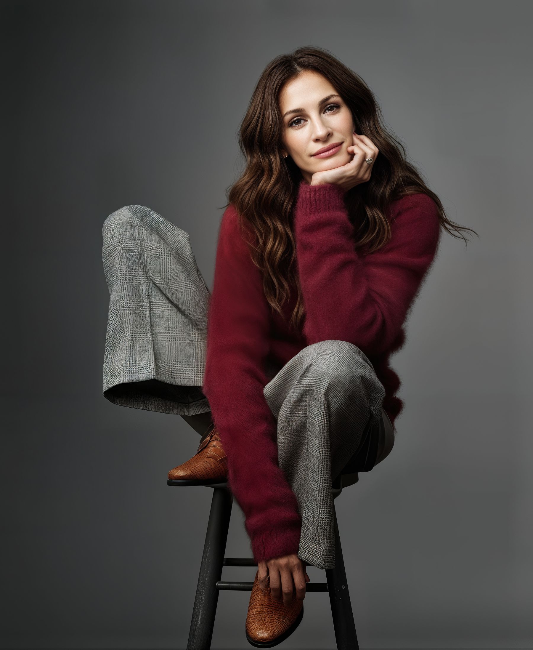
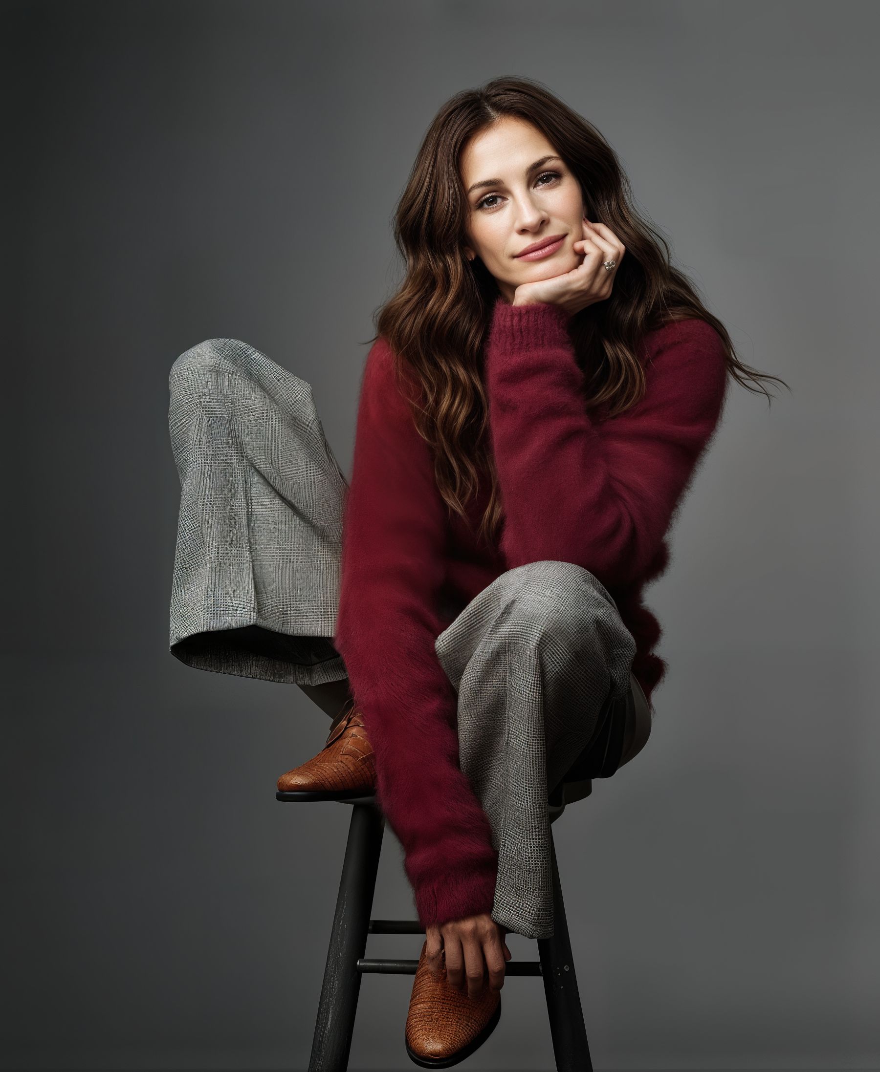
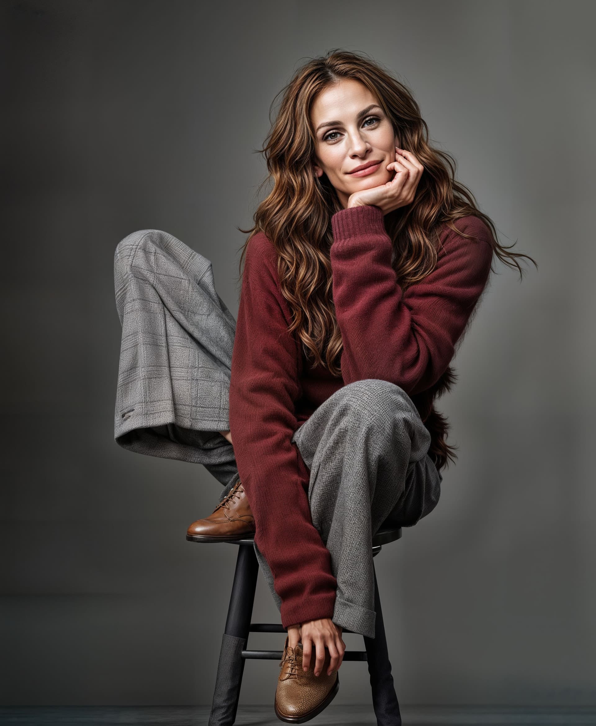
C2200 result looks like Julia Roberts

.
.
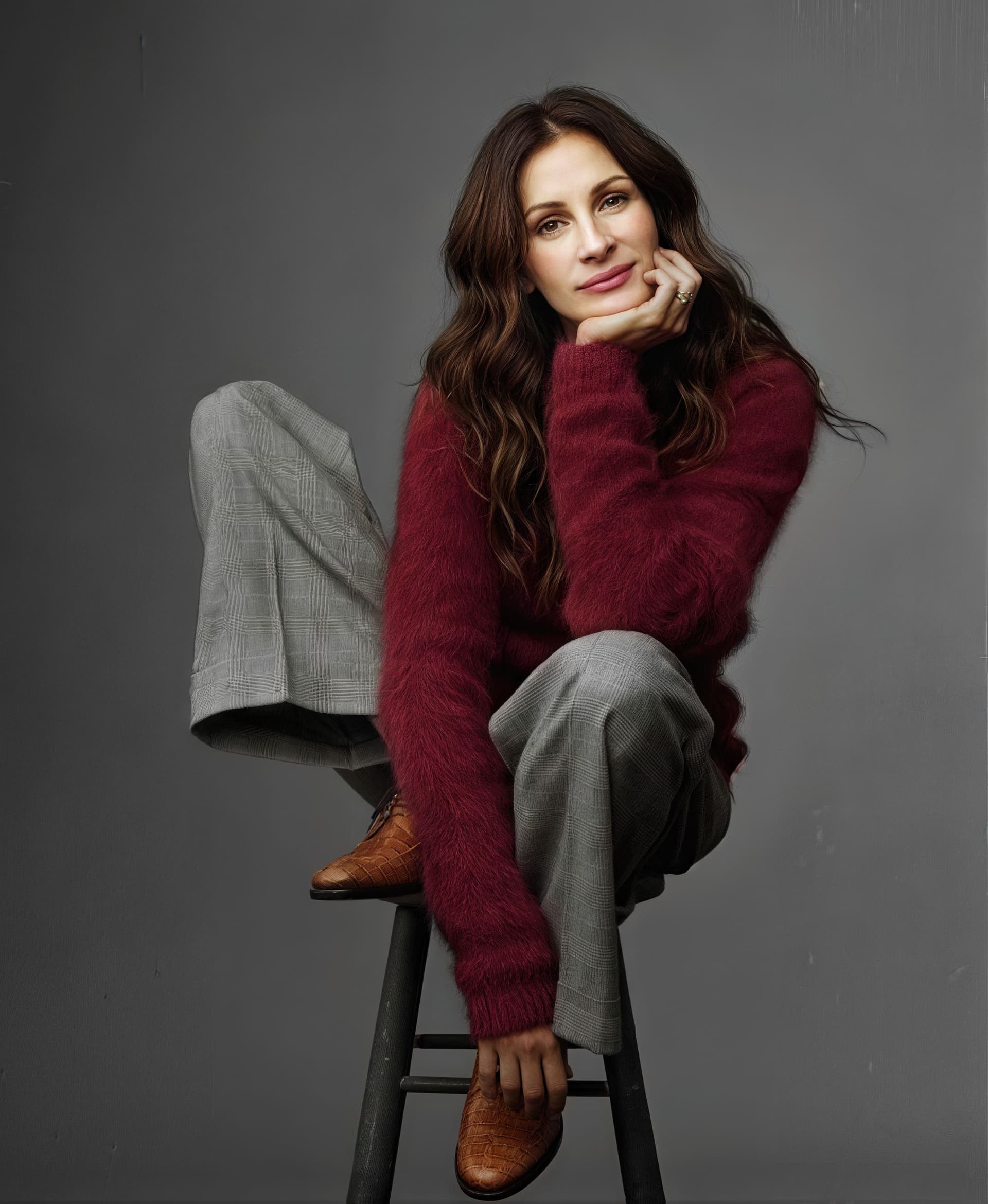
C3200 - with Creativity 3 image starts to look less like Julia Roberts - shoes gone Italian snakeskin ?

.
.
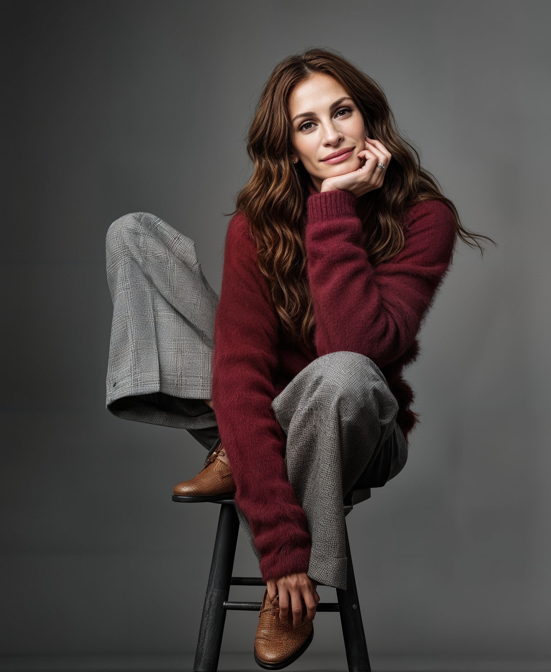
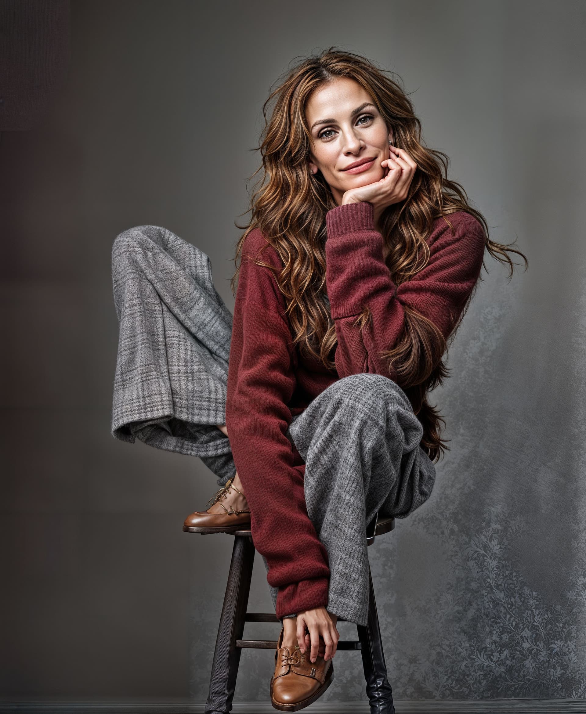
C4200 - Topaz Girl definitely appearing ? pants texture starting to breakdown - shoes + measles ?

.
.
C5200 - pants texture changed shoes very “spotty”

.
.
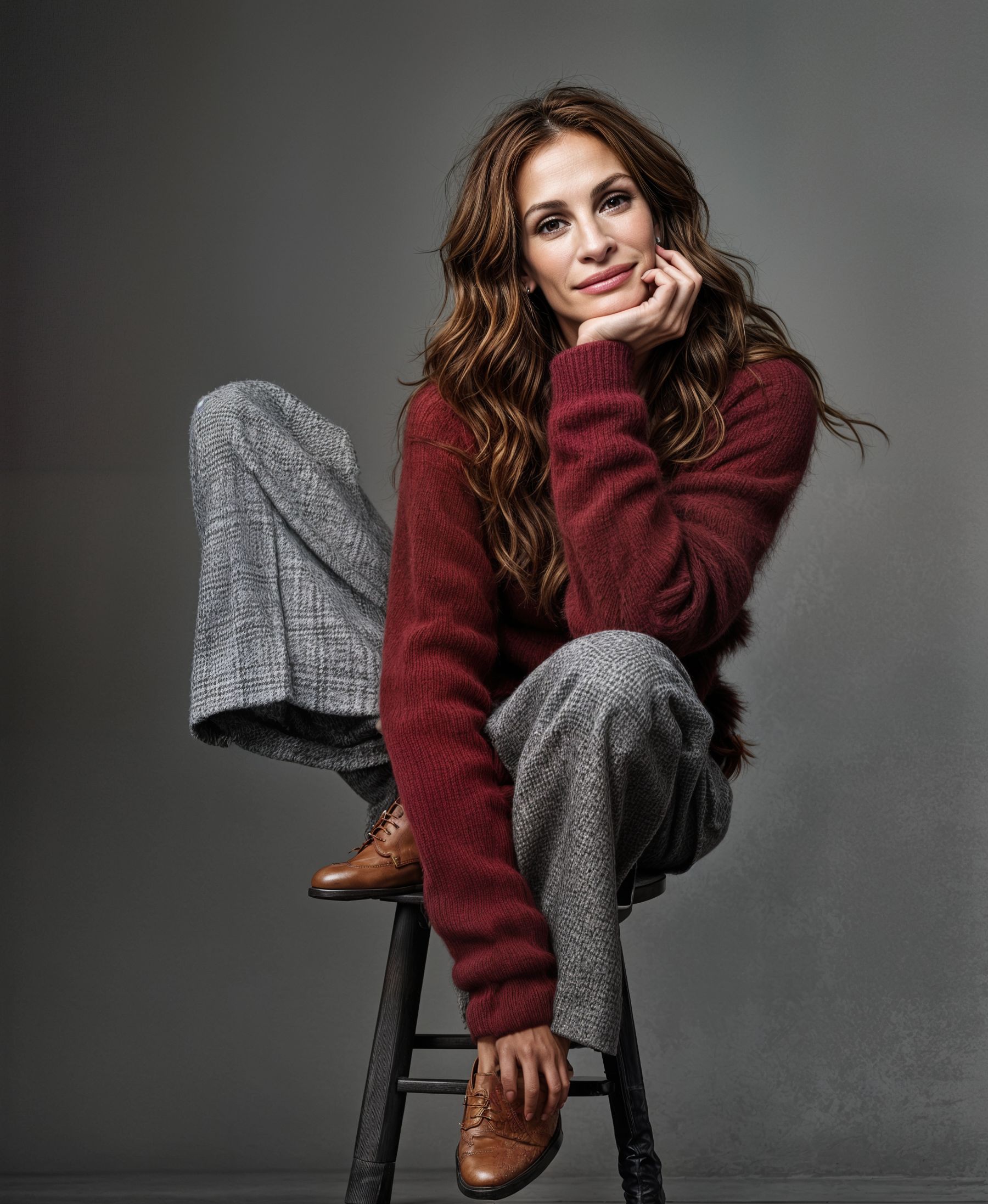
C6200 - grey “tartan pattern” pants gone psychedelic - shoes now have stitched toecaps

.
.
zzzzzzzzzzzzzzzzzzzzzzzzzzzzzzzzzzzzzzzzzzzzzzzzzzzzzzzzzzzzzzzzzzzzzzzzzzzzzzzzzzzzzz

The next set of images use my self generated simple text prompt : " actress Julia Roberts sitting on a tall stool, wearing grey houndstooth trousers and a shaggy maroon cashmere sweater "

The addition of a prompt stabilises the facial resemblance to some degree but Julia ages as the Creativity increases ? The pants texture is probably better ? Look at the shoes for a wide degree of differences and the hair texture and colour changing.
It’s interesting how Texture setting as well as Creativity changes the results in details

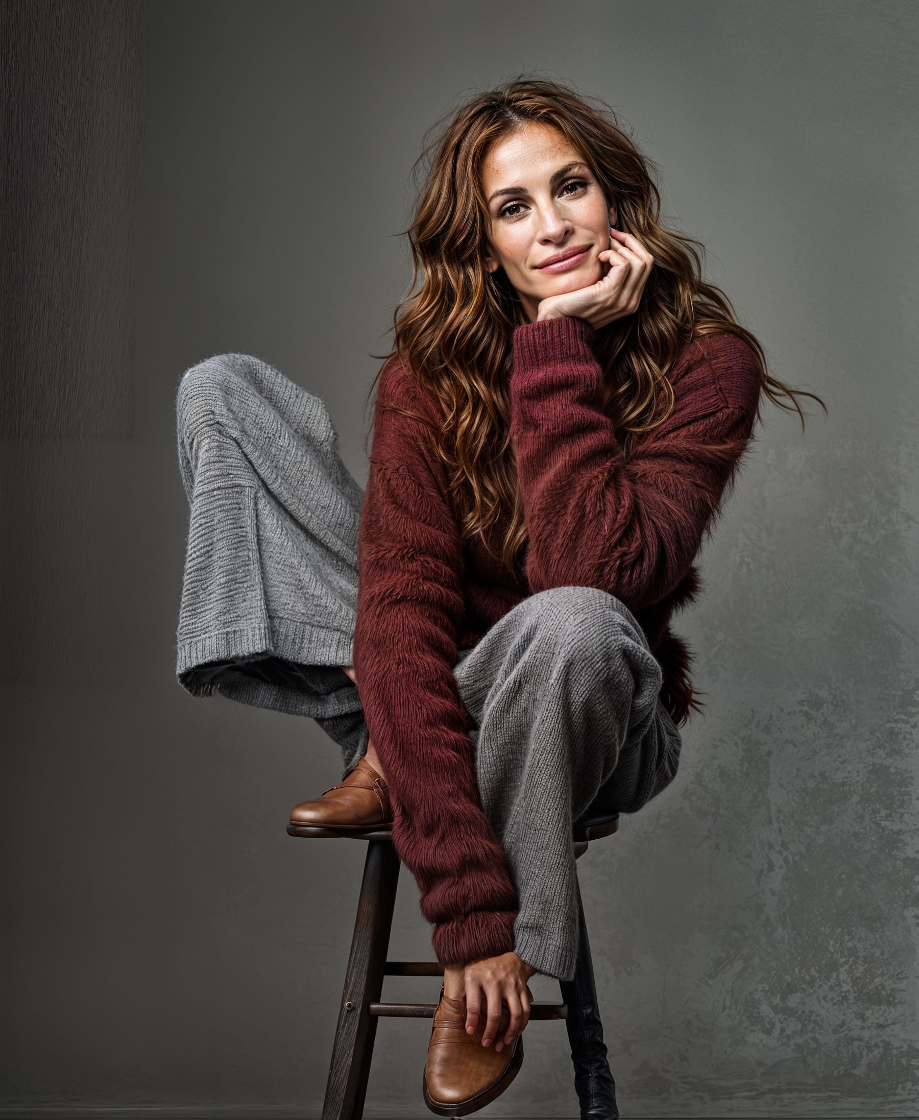
C2200 with simple text prompt


.
.
C3200 with simple text prompt

.
.
C4200 with simple text prompt

.
.
C5200 with simple text prompt – note that with Creativity 3 the right hand stool leg starts to MELT

.
.
C6200 with simple text prompt

.
.
C6300 with simple text prompt

.
.
C6400 with simple text prompt

.
.
C6500 with simple text prompt - in this combination the render breaks down !

.
.
zzzzzzzzzzzzzzzzzzzzzzzzzzzzzzzzzzzzzzzzzzzzzzzzzzzzzzzzzzzzzzzzzzzzzzzzzzzzzzzzzzzzzzzzzzzz

Then an expanded long text prompt was generated at : imageprompt.org using the option : Describe Image in Detail and changing the suggested “A woman sits …” to
" American actress Julia Roberts sits …"

American actress Julia Roberts sits on a stool, wearing a maroon sweater and gray plaid pants, in a studio portrait.

The image presents a medium shot of a seated woman against a plain, neutral gray background. The composition is simple and direct, focusing entirely on the subject. The woman sits at a slight angle, positioned slightly off-center, yet the framing is balanced. Her body language suggests a calm and collected demeanor; she is not overtly posed. Her posture appears relaxed, yet composed.

The key subject is a woman, likely in her 40s or 50s. She is light-skinned, with shoulder-length wavy brown hair. Her facial expression is calm and serene, almost contemplative. She appears to be wearing a soft, burgundy-maroon-colored, oversized sweater and gray plaid pants. The pants have a tailored, slightly loose fit. The woman’s shoes are a medium brown leather style.

The artistic style is straightforward portrait photography. The image seems to be a studio portrait, with controlled lighting and a plain backdrop to direct the viewer’s focus completely on the subject. The lighting is even, with no harsh shadows, suggesting a soft light source. The focus is sharp, and details like the texture of the clothing are evident. The colors are muted and natural, without any vibrant or intense hues. The overall style is professional and elegant.

The setting is a simple studio environment with a plain, neutral gray background. The lighting is soft and even, illuminating the woman without harsh shadows, contributing to a calm and serene atmosphere. The overall mood is relaxed, sophisticated, and professional, likely intended to convey confidence and grace.
.
.
Expanded Long Text Prompt with settings C2200

.
.
.
There is no real discernable difference in using this long expanded text prompt compared with the simple Prompt. My experience suggests that a short but effective prompt does the job when starting with an existing image. Long detailed text prompts are better for AI that totally generates a picture using only text but may not be necessary for Gigapixel when starting from an existing image or photo.

zzzzzzzzzzzzzzzzzzzzzzzzzzzzzzzzzzzzzzzzzzzzzzzzzzzzzzzzzzzzzzzzzzzzzzzzzzzzzzzzzzzzzzzzzz

The third set of images uses a FREE ChatGPT prompt built from the starting Julia Roberts test image and asking for “A very detailed text description of the image”. A more sophisticated text prompt may be available using the Subscription ChatGPT service. Online chats say that service can accurately identify almost all celebrities and well known objects and scenes which can improve the results that it produces. The FREE service offered this : "once again I changed the offered "A woman " to "American actress Julia Roberts "

American film actress Julia Roberts sits comfortably on a tall stool against a neutral grey background, radiating a calm, confident energy. She wears a soft, textured burgundy sweater paired with loose-fitting grey plaid trousers, exuding a blend of elegance and cozy style. Her brown leather shoes add a vintage touch to her ensemble. Her long, wavy brown hair frames her relaxed face as she rests her head gently on her hand, creating an intimate and thoughtful pose. The overall composition feels warm and inviting, showcasing a stylish yet natural moment captured in a studio setting.

American film actress Julia Roberts poses gracefully while seated on a tall, dark wooden stool in a minimalist studio with a soft grey backdrop. Her posture is relaxed, with one leg bent and resting on the seat, the other hanging naturally. She is dressed in a cozy, deep burgundy fuzzy sweater that adds rich texture and warmth to the scene. Her trousers are wide-legged and tailored, featuring a subtle grey plaid pattern that contrasts nicely with the deep hue of her top. She wears polished, brown leather oxford shoes with a textured finish, peeking out from beneath her pants. Her long, brunette hair falls in soft waves around her shoulders, and she gazes gently at the camera with a serene expression. Her right hand supports her face, her fingers lightly touching her cheek, subtly highlighting a gold ring on her finger. The lighting is soft and flattering, emphasizing the texture of her clothing and the natural tones of her skin and hair. The composition and styling together evoke a timeless, effortlessly sophisticated atmosphere.
.
.
In this set there are similar differences as Creativity and Texture increases. With Texture 3 and above these changes are certainly unacceptable.

ChatGPT prompt C2200


.
.
ChatGPT prompt C3200

.
.
ChatGPT prompt C4200

.
.
ChatGPT prompt C5200

.
.
ChatGPT prompt C6200

.
.
ChatGPT prompt C6300

.
.
ChatGPT prompt C6400

.
.
ChatGPT prompt C6500 - once again this combination breaks down

zzzzzzzzzzzzzzzzzzzzzzzzzzzzzzzzzzzzzzzzzzzzzzzzzzzzzzzzzzzzzzzzzzzzzzzzzzzzzzzzzzzzzzz

Another variable is the sized of the final image - bigger tends to be better ?
These 4 images were upscaled 3x and if you have read this far you can probably identify and grade the differences yourself !!!

C2200


.
.
C3200

.
.
C5300

.
.
C6310

.
.
zzzzzzzzzzzzzzzzzzzzzzzzzzzzzzzzzzzzzzzzzzzzzzzzzzzzzzzzzzzzzzzzzzzzzzzzzzzzzzzzzzzzzzz

The final 2 images here have been done with the Cloud render option using C2200, one at 2x (2 credits) and one at 3x (3 credits). This level of Creativity and Texture was chosen as being the “best” combination in my opinion - interesting if anyone agrees or disagrees !

The 3x Cloud render is notable for the two upper corner “ghosts” which are certainly artistically creative and the two lower corner “ghost artifacts” which are not so welcome !

Cloud C2200 x2


.
.
Cloud C2200 x3

.
.
zzzzzzzzzzzzzzzzzzzzzzzzzzzzzzzzzzzzzzzzzzzzzzzzzzzzzzzzzzzzzzzzzzzzzzzzzzzzzzzzzzz

My overall conclusion is that the best combination of settings isn’t always obvious and some trial and error is often needed to choose the result you like most.

I have done a lot of testing on these sets and many more on other starting images concentrating on the differences between “long or short prompts” and these sets seem to confirm that an adequate effective text prompt is analogous to “The cavalry arriving just in time!” It’s enough !
An over-long text is often extra work for nothing.

I’m sure some if not many may disagree !!!

I would welcome any comments and or recommendations for improvement as well as any necessary corrections or contrary advice you may like to offer.

Many thanks for your patience and interest if you read this far.

6 Likes

I find that for making a nice text prompt from a source image, Google Gemini seems to be better. The description is neither too long nor too short. Just right. And it works well. I also use the combination of Recover V2 and Low Resolution without Scaling if the image is already between 2k and 4K initial resolution. Then, for the final scaling, I use the combination of (either Low Resolution v2 or Hight Fidelity), Recover V1 and V2. I assemble the best parts of each variant in Photoshop.

A small example of how to describe a photo using Google Gemini for this image:

Precise description of the photo :

A budgerigar is perched on the right fork of a Y-shaped branch. The bird is mostly greenish-yellow, with the typical black stripes on its head and back. Its head is tilted slightly upwards and turned to the right, giving the impression it is looking at something out of frame or is attentive to a sound. The cere above its beak appears brownish or pale pink, suggesting a female or a young male. Its tail feathers are long and dark, with yellow and blue accents near the body. It firmly grips the branch with its pink feet. The branch has rough bark, greyish and brown. The background is a blur of greenery (bokeh) behind a fine-meshed wire netting or net, also blurred. A cable or bar crosses horizontally near the top of the background.

Variant without the animal:

The image displays a Y-shaped tree branch with rough bark texture mixing grey and brown. The branch stands out against a blurred background composed of fine-meshed wire netting or net, behind which lies an indistinct mass of green vegetation. A dark horizontal line (cable or bar) crosses the upper part of the background.

Well, the photo has already been processed in its current resolution to redefine the details. I’m currently scaling to 8160x6120, which is the resolution of my photo sensor.

1 Like

Thank you for your reply - I will take a look at Gemini.
I will also try your workflow on some of my test images.
At the moment quite a lot of my work is on old postcards (low res scans from Facebook)
and not so many 20-40MP photos from my cameras.
I need to do some more testing on downscaling for sure.

When downscaling, the range remained between 2K and 3K minimum. 4K maximum. Beyond that, I’ve already tested, it doesn’t manage to recover 100% detail. There are sometimes blurred areas where there was no detail in the source image.

Very interesting (and certainly time-consuming). As for prompts, it’s hard to say what type and content is optimal even for a specific AI implementation. Moreover, it can change over time (updating models by retraining with additional new examples, etc.). Perhaps some approximate generalizations can be estimated (“when will Topaz Girl start to emerge?”), and moreover, different results may be optimal for different users. The number of boundary shapes separating good and bad results can be unmanageably large. This also applies to text prompts. Each of us would probably describe the same photo differently, although often (very) similarly. However, AI describing photos is useful in that it can save a lot of handwriting and the result can be edited to one’s liking. Alternatively, the outputs of different text generators can be combined and edited. So your conclusion holds:

[Zed1’s] overall conclusion is that the best combination of settings isn’t always obvious and some trial and error is often needed to choose the result you like most.

1 Like

Thank you for your reply.
I’m fairly sure that maybe more “advanced” AI will generate better and more optimized text prompts and produce better improved rendered images but I don’t yet have the knowledge or experience to rate the readily available image to text description apps we have today.

I also don’t know enough about Topaz Photo AI Personalization data and the effectiveness of its claim to “learn” from how we edit images. Personal data sets are likely to be so small that I’m rather skeptical as to how effective that process can be in practice. My general knowledge and Google tells me that at least several thousand tests if not hundred thousands of tests would be needed for teaching an AI learning system. This year I have tested something like 600 images in Gigapixel AI and Photo AI but I doubt if there is any discernable logic or pattern in what settings I’ve used because I’ve been trying everything possible. Actually I suppose I have learned quite a lot so maybe I need to be happy I can now canter if not yet gallop.

In Photo AI it seems each release resets the number of “learning” images edited ?
If we do testing by trying all or many different model settings then the learning process is going to conclude we are crazy because our choices are so varied ?
So I don’t see how Autopilot is going to learn what’s best for us as individuals.
I would have thought that the whole Topaz experience - claiming that they have used several millions of training images - should be producing a better set of AI guidelines for what settings to use for any image. But so far I don’t find that Autopilot is suggesting the best settings every time.
What I do acknowledge is that what we can do in Topaz today is so much more than we could do one year or even six months ago. So if the rate of development speeds up we should experience a lot more advances in the next year. Keep rolling on Topaz !!!

BTW, now I tried also an online photo descriptor, which gave me a long description of a picture of a cat on the steps – pretty much identical to my very brief prompt. The content of the image is recognized well, I couldn’t have described it better myself. It didn’t change the result, but a more detailed description may have an effect on other, more complex images. Other descriptors provide very similar descriptions, usually more-or-less differing in structure or/and in their focus on various details. In any case, the possibilities are wide and interesting, supporting the correct focus of the AI ​​for a specific situation:
https://imageprompt.org/describe-image

A ginger cat is climbing on a set of wooden shelves installed on a wall.

The image shows a scene of a cat positioned in the middle of the image, appearing to be in the midst of climbing or moving across a set of wooden shelves. The shelves are simple and circular in shape, mounted horizontally across the wall. The cat is centered in the image and is in a profile view, showing its body angled slightly downward as it seems to be traversing a space between the shelves. The light in the image is even, casting no notable shadows, and the wall is a plain white color.

The main subject is a ginger cat, a medium-sized feline with a predominantly orange-tan coat. Its fur appears smooth and short, with the characteristic tabby stripes visible on its body. The cat is in a dynamic pose, its body angled as if climbing or maneuvering between the shelves. Its expression is alert and attentive, perhaps drawn to something beyond the shelves.

The artistic medium is photography. The image is well-lit and clearly shows the cat climbing on the shelves. The shelves are simple in design and the image’s focus is entirely on the cat and its position in relation to the shelves. There is no particular style; the focus is on capturing a moment.

The setting appears to be an interior space, possibly a home. The wall is plain white and there are some other objects beyond the shelves that are slightly out of focus, suggesting that the shelves are positioned in front of a door or a wall opening. The lighting is ambient and soft, suggesting natural light. The mood is calm and neutral, with the focus on the cat’s interaction with the shelves.

Autopilot: I don’t think that Autopilot adapts here to an individual’s work style (which, on the contrary, is done by, for example, a spam filter for e-mail, which is simpler but not 100%). I don’t know its specific implementation, but maybe it is trained to recognize the most common scenes (face, landscape, cat, Topaz Girl, …, whatever is possible in terms of implementation) and then offer some (statistically, with minimized variance) most common photo editing. Then the “average” should represent more than half of the user’s satisfaction with the implicit editing offer. But that also means that it may suit only 51% of cases and not suit 49%, or otherwise.

Too many conflicting SW and HW requirements, too wide variance, but there is a possibility to set some editing parameters individually in TPAI or TPGAI (which is positive; other producers of similar software do not always allow this for practical reasons). But all of this is just my speculation. Not only AI has to train; we have to too :slightly_smiling_face:.

Hi Masnsen!
We are still investigating this issue. Please submit a ticket with our Support team and we can communicate with you more directly.

Please provide your system logs and system profile as that will help greatly.

Thank you!

Not bad if you stay within the original resolution. If I increase this photo by 2 or more, the result won’t be as good. Already tested.

The only thing that bothers me is that he didn’t properly detail the nettles around him. Whereas the prompt generated by Google Gemini clearly identified them.

The prompt in question:

A wallaby with dark, brownish-grey fur featuring reddish tinges, especially visible on the shoulders, sits amidst dense, green vegetation. It holds a typical upright posture, supported by its hind legs and tail base (not fully visible), with its small forepaws held close to its chest. Its head is turned to the right and slightly lowered. It is surrounded by a thick carpet of plants with serrated green leaves, resembling nettles, among which small purple flowers grow. The immediate background shows earthy ground, a greyish rock, and a patch of dry vegetation on the left, and more indistinct, sunlit bushes on the right.

But I can make up for it with a variant made in Photo Ai with super Focus V2. The wallaby’s hair isn’t great, but anyway, it was just for the background, with the nettle detail in sharp focus.

My perception is that, at least for my pictures, staying within the resolution is not always the, well, solution. I rather believe that Redefine has sort of a sweet spot sizewise that is somewhere between 1.5 and roughly 3 megapixels, meaning that input pictures smaller than 1.5 MP are better texturewise when 2x is used. But that may depend on how good the texture is in the original picture. When I upscale video stills that are, when cropped, about 1 to 1.5 MP, 1x is rarely an option because the texture gets too arbitrary. I sometimes try 1x for comparison but usually, 2x works better for me, be it creativity 2 or 3.

unfortunately not this version but we are working on it

Oh well. Thank you for responding and keeping us updated.