Hi Thomas, you may try low enhancement strength for High quality image with 1x or 2x.

Oho. Didn’t update until this very moment - time to take ‘Hikaru no Go’ and ‘Douluo Dalu’ manga JPEG-destroyed examples for a spin! 
Is it safe to switch to non-English locale now? Just curious, because I’ll stay on EN language for the time being, to be on the safe side.
EDIT: During the installation (setup file, not the in-app update), the installer removed Wonder v2 blobs, and downloaded v3 - is that intended? The ‘repair’ install does download v2 files, as I write this, though. Free disk space oscillates between 77GB and 90GB (while repairing), it seems the installer looks through model files and clears out about 20GB of 45GB (excluding blobs). Huh. Good to know!
I did send in the image and logs, but I just did a Windows Repair of Topaz Photo, as suggested by mikmod1, and Wonder 2 now works again.
2 Likes
I’d say, Wonder v3 is interesting (enhancement: medium)!
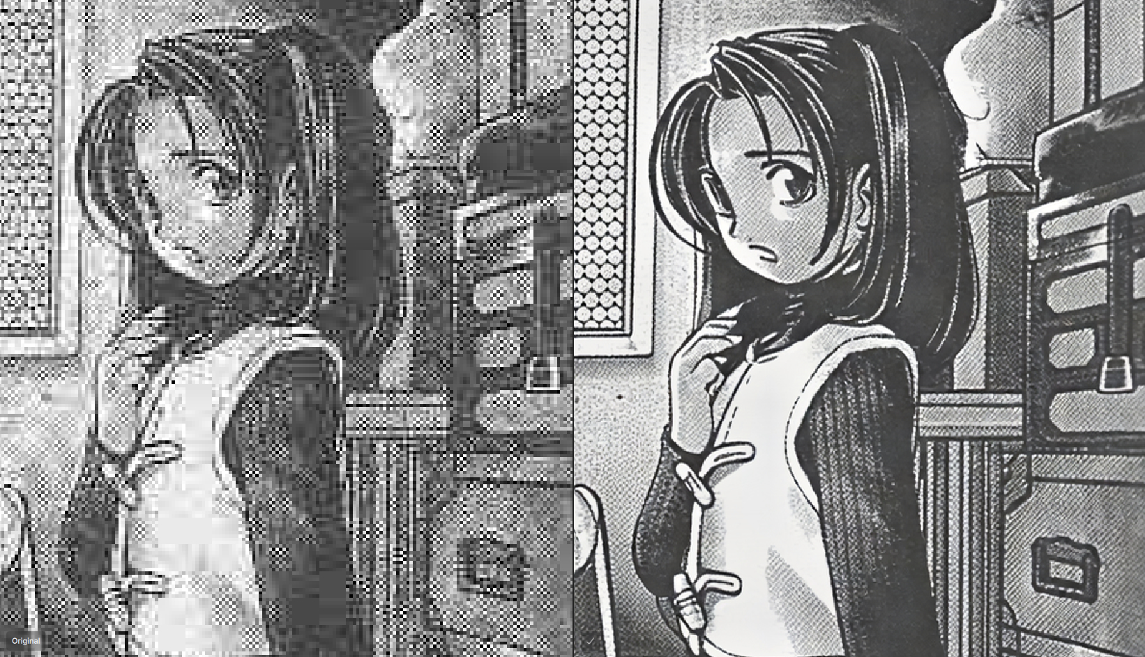
Wonder v3, enhancement: high (whoa!)
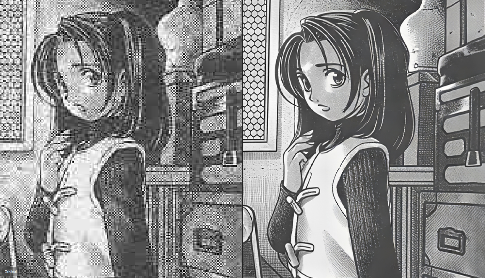
The very same part with Wonder v2 (also very nice - the RAW POWER ):
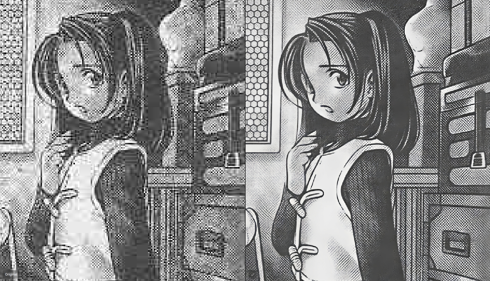
Wonder v1:
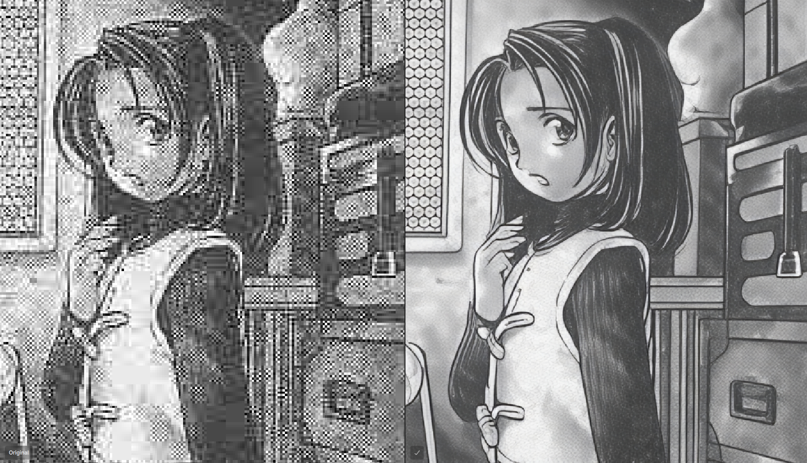
Local, of course. This is going to be fun!
This is amazing. Can’t believe Wonder v3 High can clean THIS:
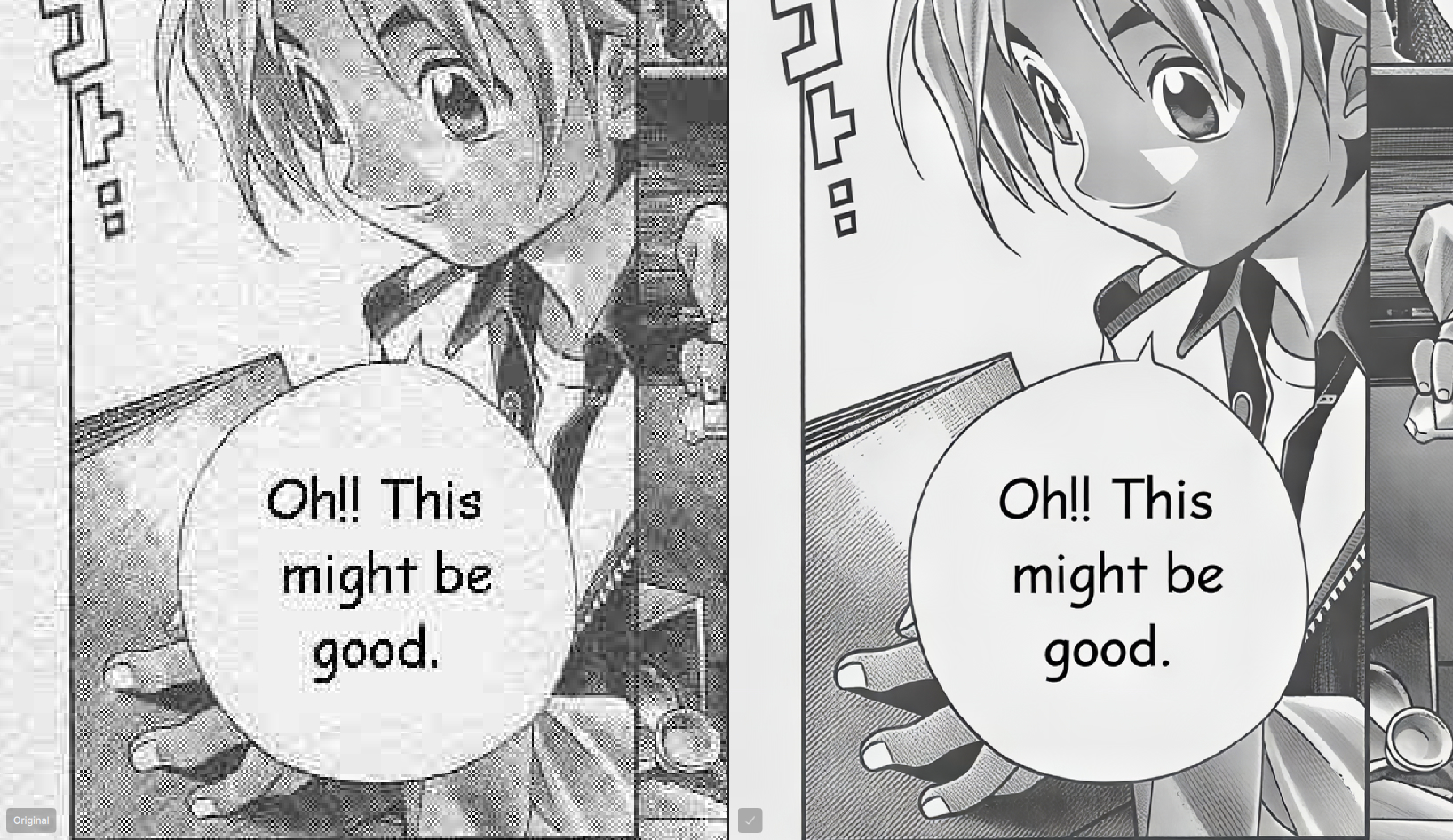
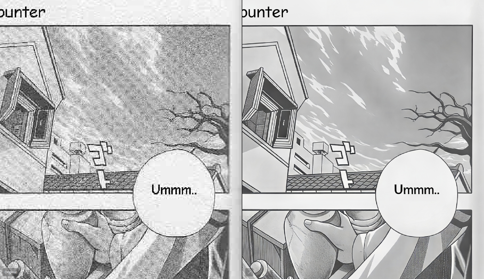
Standard MAX is also VERY good:
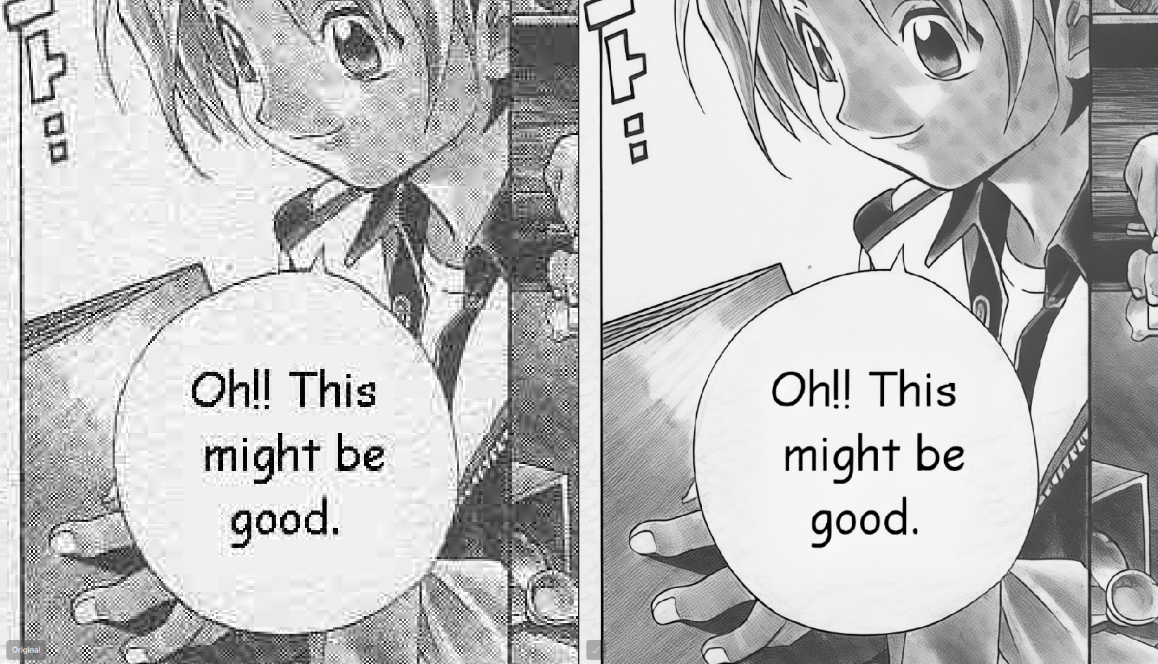
6 Likes
A post was split to a new topic: Remove tool issues when making multiple selections
I will try.
Her expression did change.
To me it does not fit anymore to what she said.
2 Likes
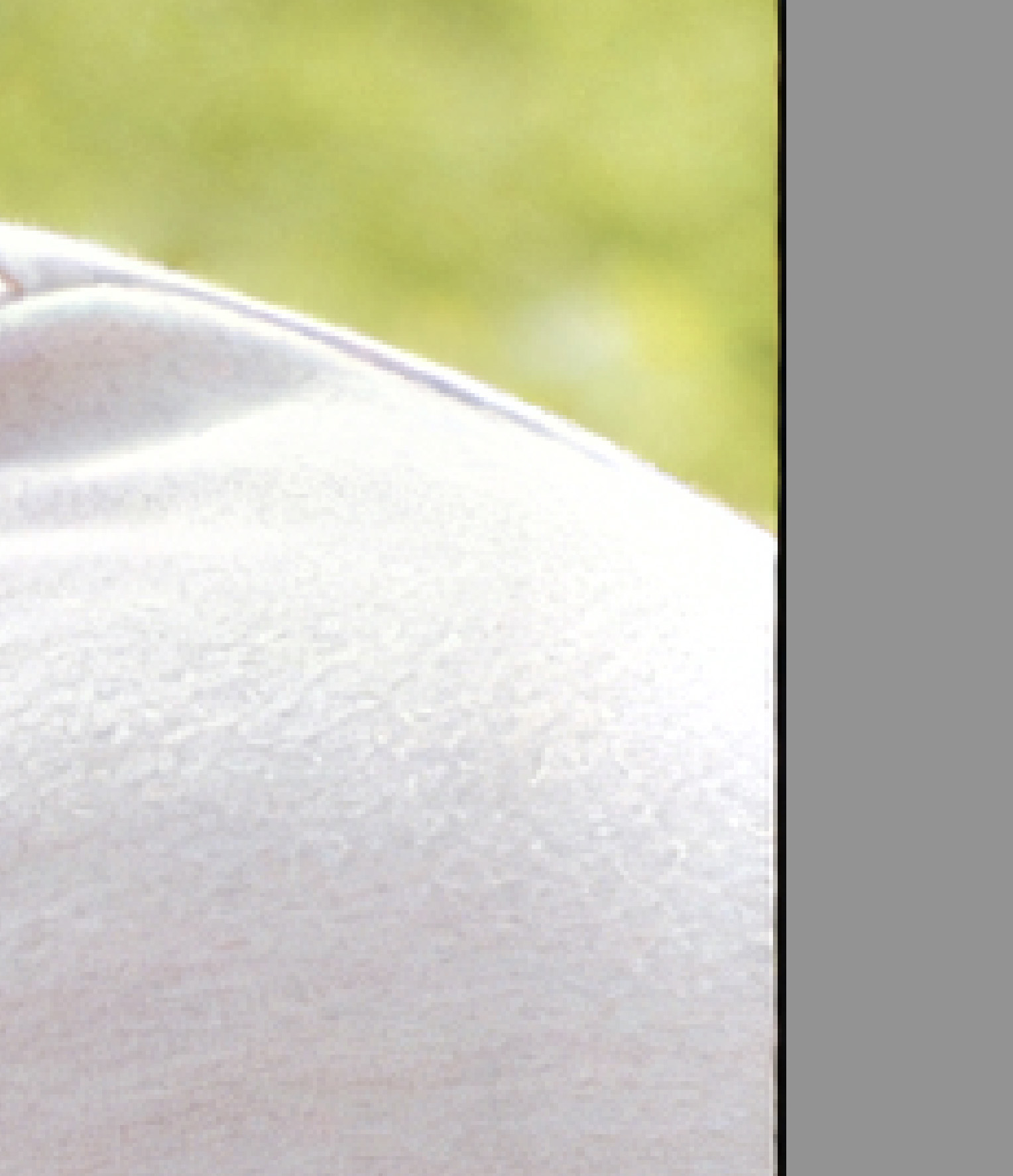
But the Border-Problem is not solved, there is still a black Border and in some Cases an unclean Double contour:
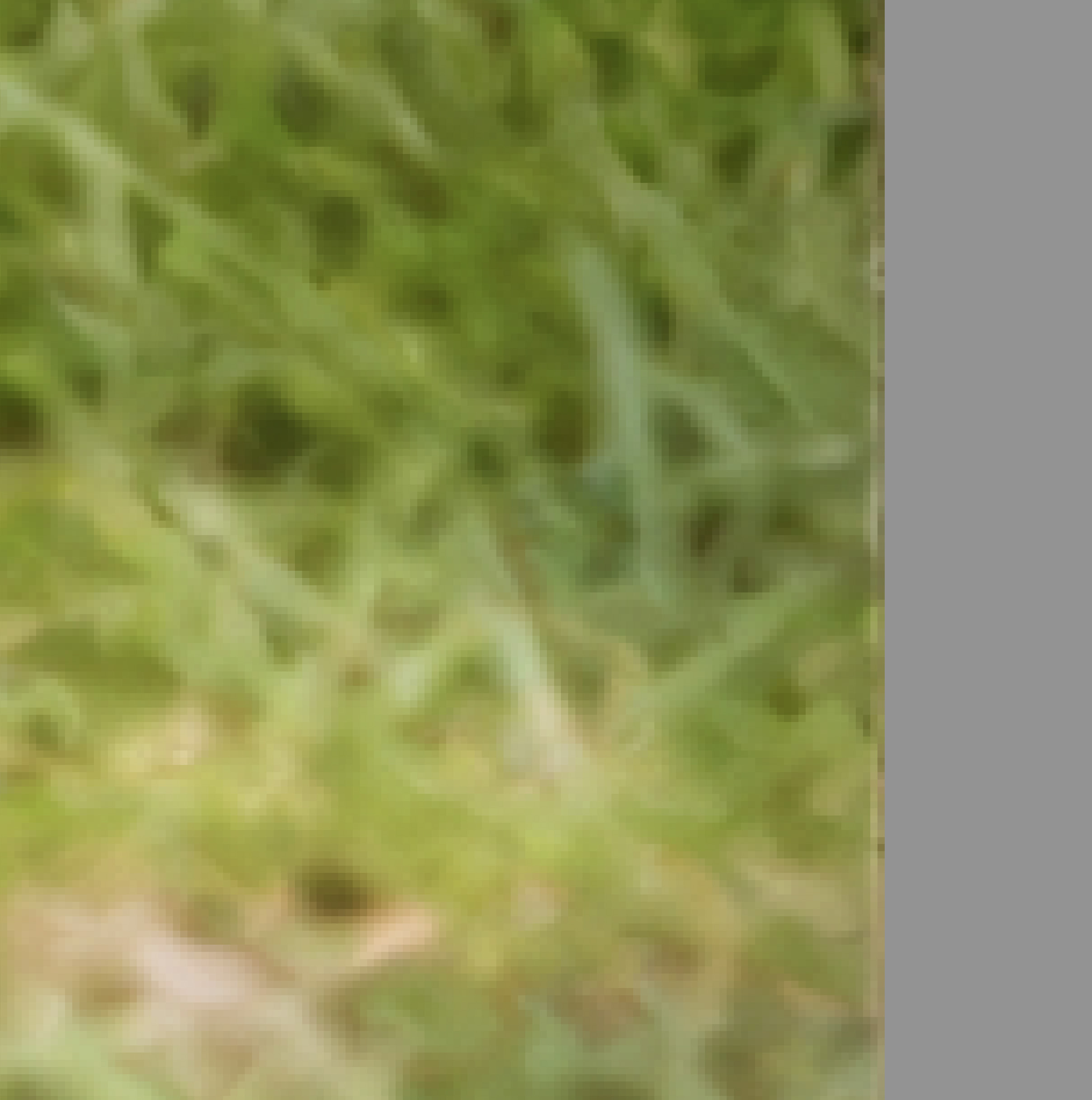
2 Likes
Are you currently still working to optimize the WonderV3-Modell?
I would say its better , but still a little bit too smooth now in some Cases
I’m not happy with Wonder 3 (Medium). In very specific cases, it is indeed better than Wonder 2, but in most cases it’s much noisier and preserves detail worse than Wonder 2. Wonder 3 High changes a lot of details; although it produces a sharp, clean image, it sometimes looks very artificial. Here’s a comparison of Wonder 3 Medium (left) vs. Wonder 2 (right). Both at 6x
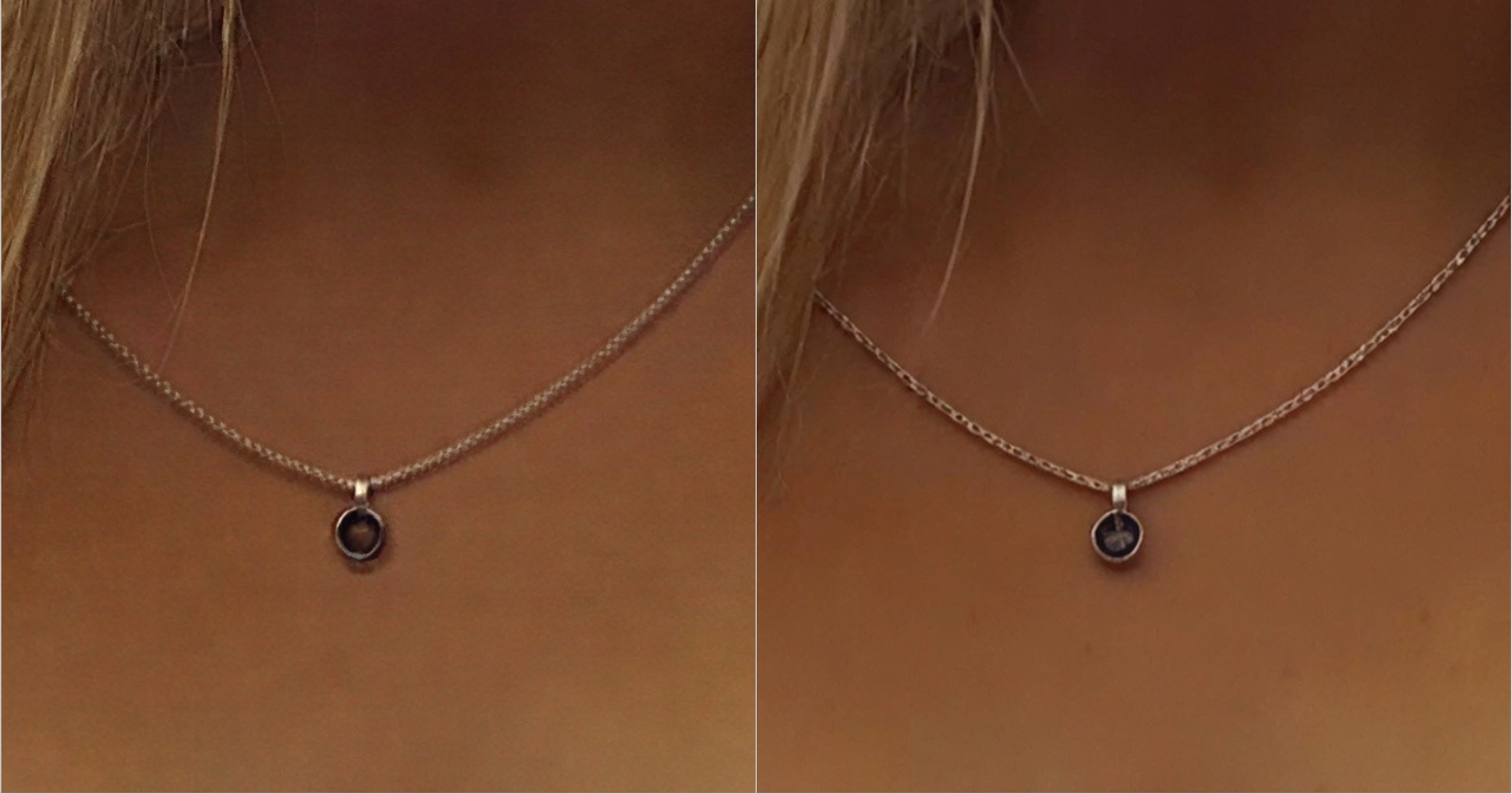
4 Likes

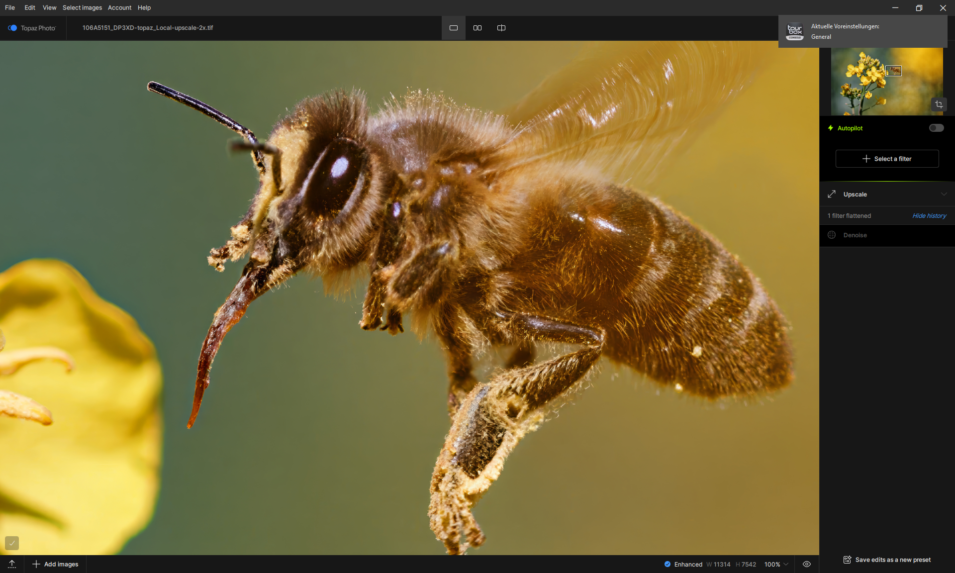
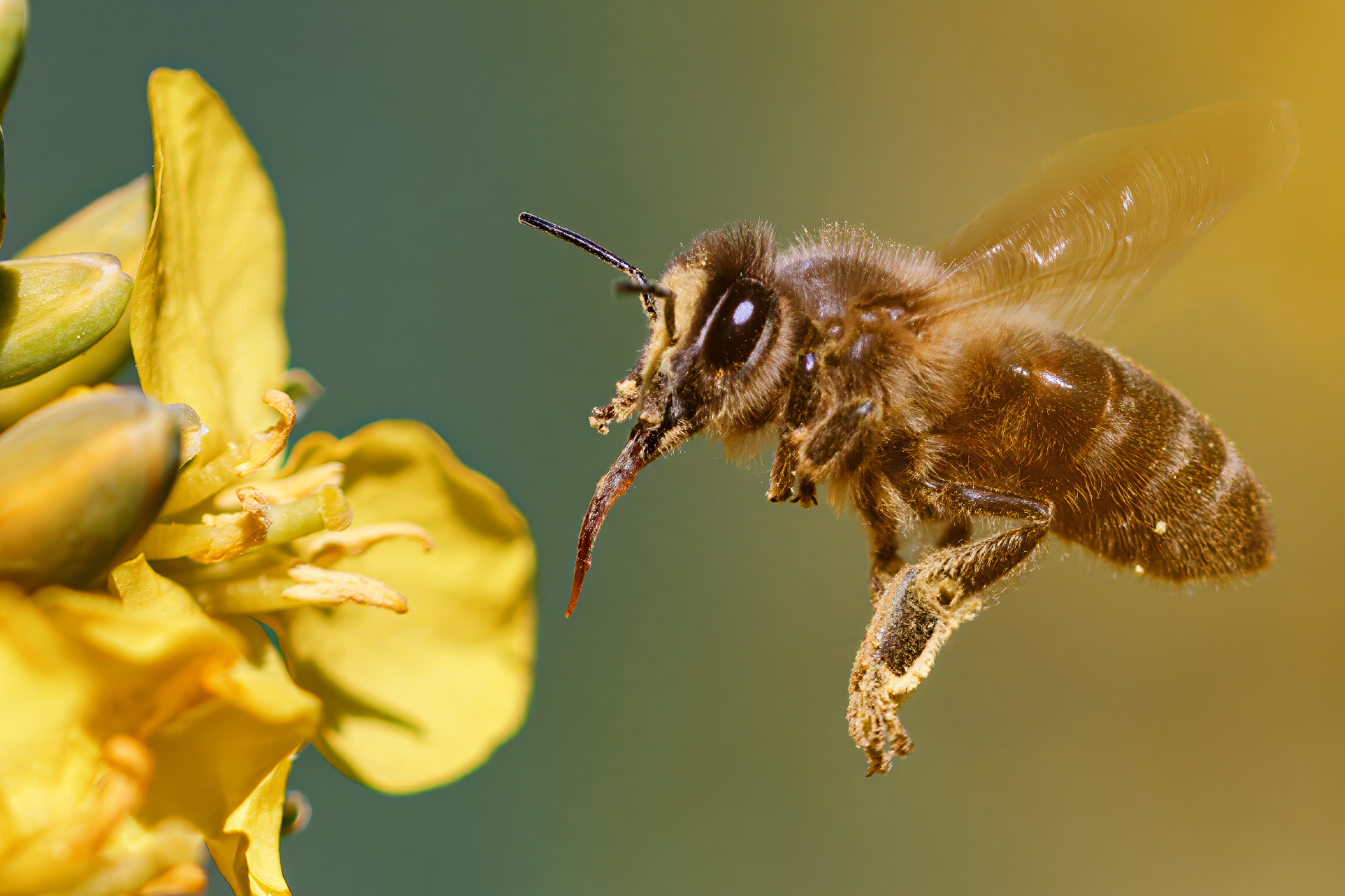
The Low and Medium enhancement in Wonder v3 model is probably ‘interfering’ with the image less, than usual, to be able to give you that Low-Medium-High choice, but that means the result will be a bit ‘rougher’, too. I see that in the HikaGo manga page example, too.

I am working on it based on your feedback, especially on low and medium. The black border issue you shown is a new issue and I will look into it.
2 Likes
A little off-topic.
I really appreciate the quite instant replys/reactions to user reports by Topaz’ devs in the last week or so. This was a bit missing before for about one year.
3 Likes
That is exactly the design philosophy behind Low and Medium—they are intended to be less intrusive to the original image. However, based on the feedback we’ve received, I agree that the results can sometimes be a bit too ‘rough.’ I’m planning to fine-tune the strength of both settings to strike a better balance.
3 Likes
Thank you. User feedback means a lot to me. It helps me understand everyone’s preferences and ‘taste,’ which is essential for making the model even better. Thanks for helping me improve it!
4 Likes
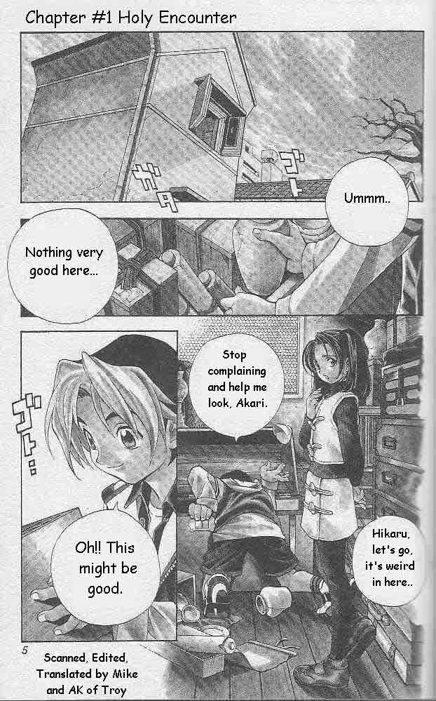
I wonder if it’s achievable by more fine-tune controls available to the end user?
Another example for Wonder v3, Low-Medium-High - in that order.
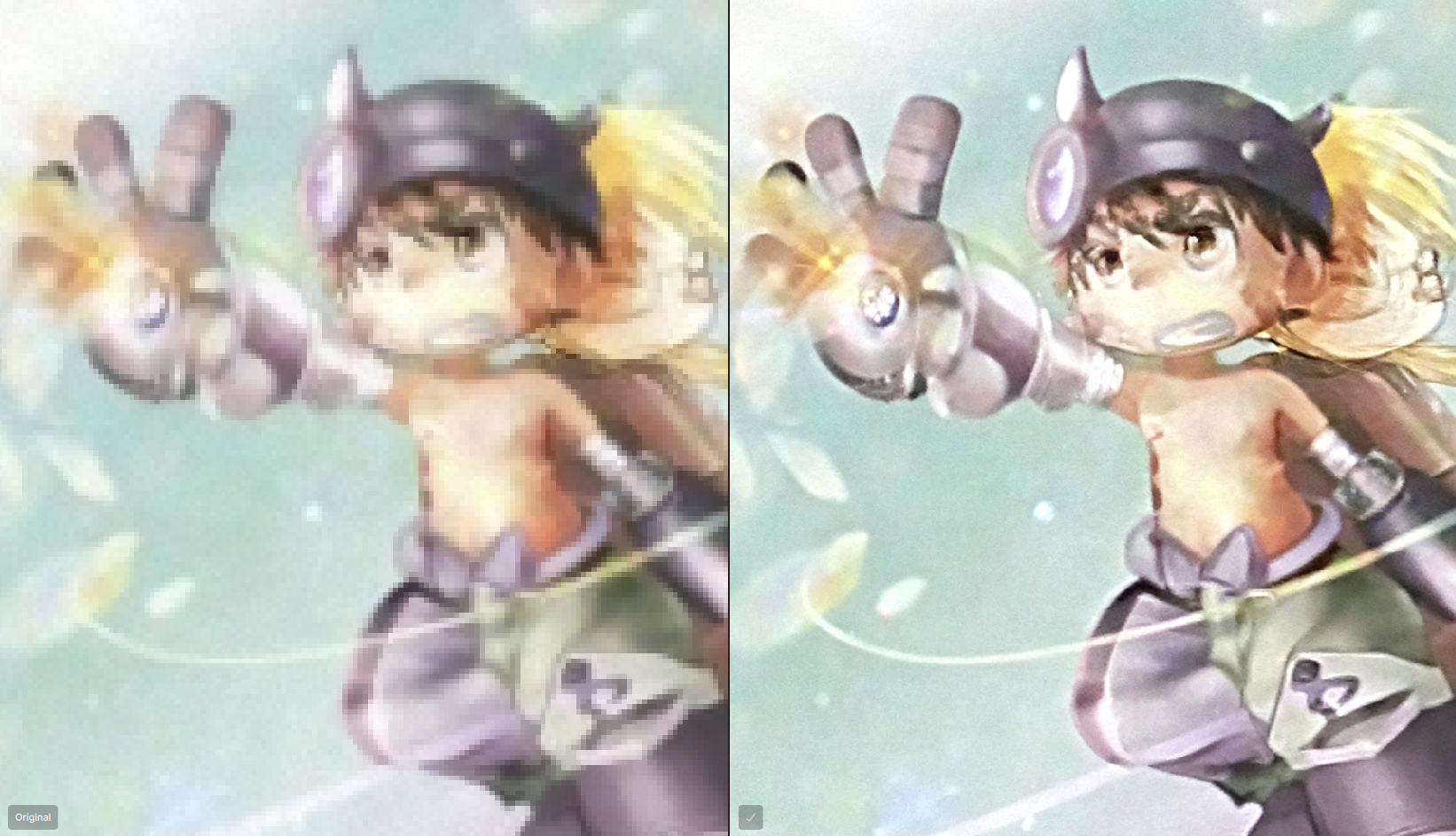

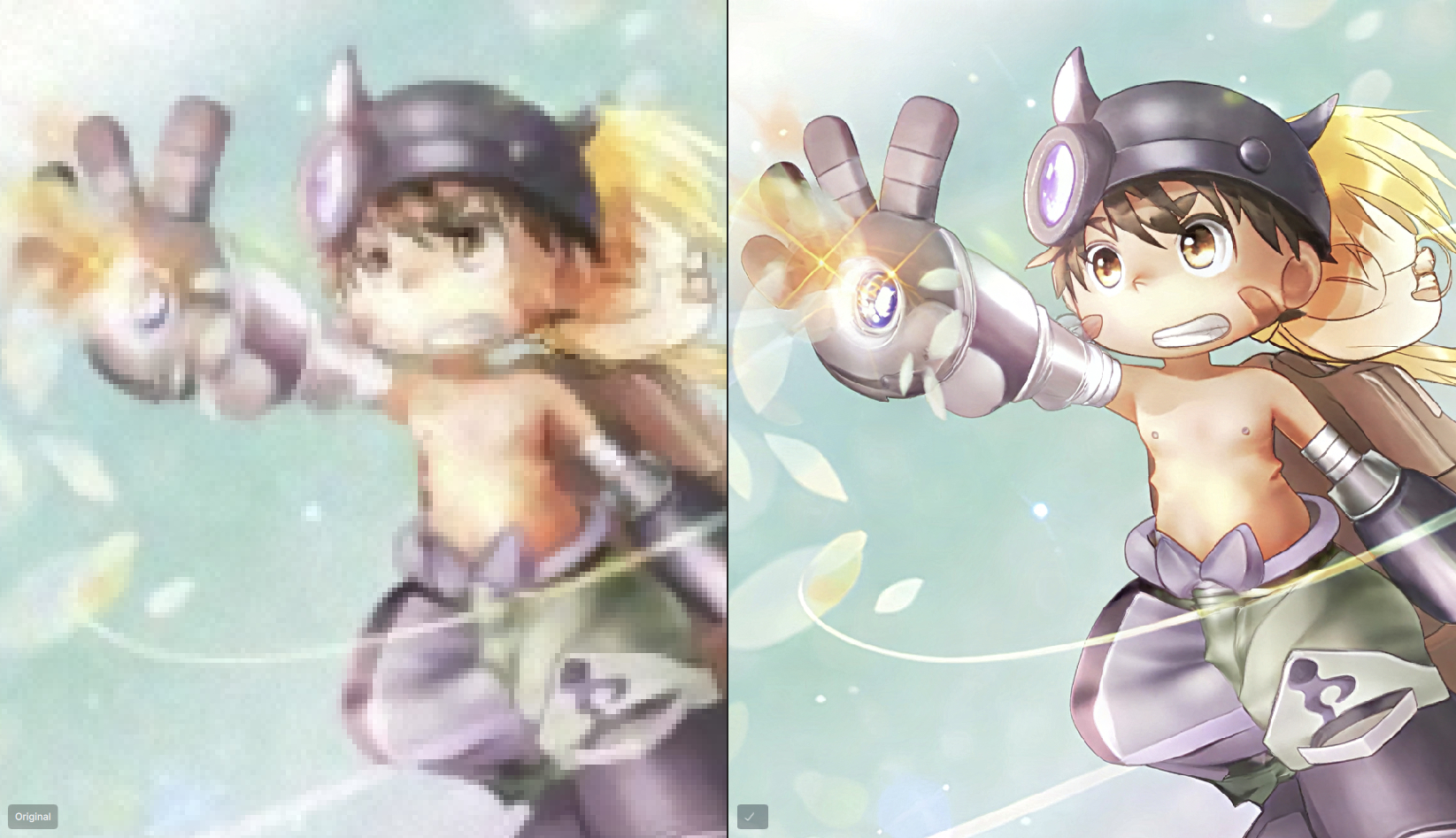
Reg has two brown ‘stripes’ on his torso sides, which were re-made by the model as a ‘flesh spike’ there (between the upped and lower stripe). It’s hard to distinguish that on the pixelated original even by a human, if one didn’t see the anime or read the manga, so it’s understandable.
4 Likes
