7 Likes

Chiaroscuro!!!
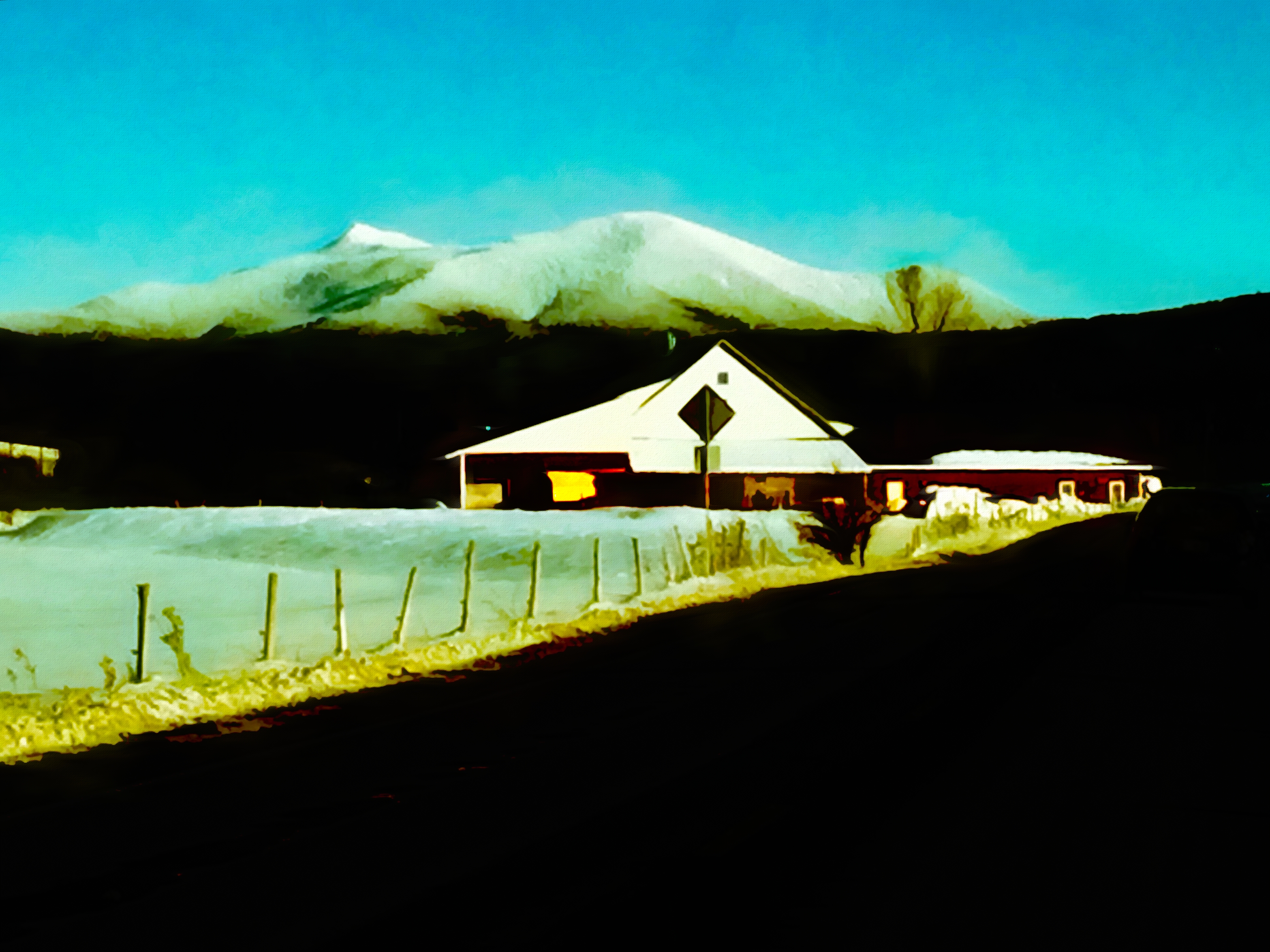
I believe the first image clearly works better.
The composition is not as strong as it could be. So the second image doesn’t work as well as the first image does with which the viewer can more clearly identify a structure.
The structure is in the vertical center of the image. I believe that both images would be stronger if, perhaps, the structure was in the upper third of the vertical center, which would allow for what would essentialy be a bold black negative space.
That’s my two cents (2.5 cents Canadian).
2 Likes
I prefer the first one.
They both have interesting color palettes
