Contrary to others, I’m disappointed with Wonder2. Typically I take photos in a folk club (in a pub). In the scene there will be guitars with their maker’s name, signs (for beers and a certain cola maker); titles of books on shelves around the bar, and so on. Plain Wonder didn’t make a great job of clarifying these texts but Wonder2 really scrambles them - ‘AI artefacts’. Plain Wonder sometimes over-sharpened a little but I’ve reverted to it for now.
If you’re open to it, we’d love to see a few before and after examples where Wonder 2 is introducing unwanted artifacts, especially on text or signage. This would help our team better understand and evaluate what you’re seeing.
You can also reach out directly to support@topazlabs.com if you’d prefer to share the images privately — we’re happy to take a closer look and assist further from there.
Hi John,
Thanks for getting in touch.
Unfortunately, I seem to have had a spring clean a little too early and deleted most of my ‘non-final’ photos. So I’ve gone back to a few taken in a very similar situation where I’ve still got the original and run them through Wonder 2. I’ve attached the before and after versions.
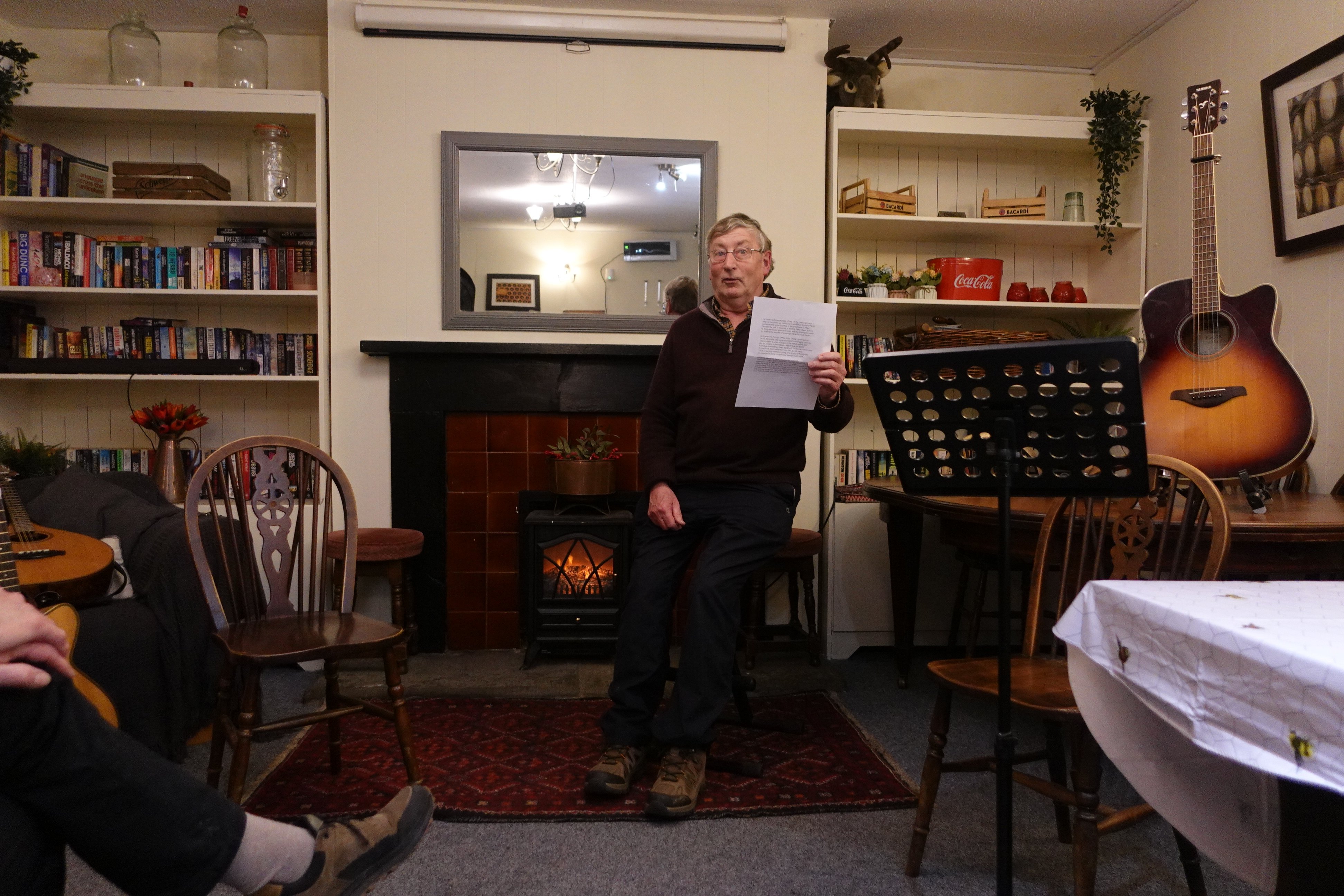
As I think I mentioned in my original post, they are taken in a folk club that is not very well lit, and to be unobtrusive I use a compact camera (Sony RX100VA – for the 1.8 lens) rather than anything fancy. And I deliberately underexpose and limit the lowest speed so as to minimize motion blur. The results are, almost inevitably, noisy and with some residual blur, but it’s the compromise that I find works best. Before ‘Wonder’ I had a routine in which I used Denoise and Sharpen (carefully choosing the most appropriate sharpening mode).
And, of course, I also adjust the framing and the lighting and colour balance.
These examples do not show some of the worst artefacts (hallucinations would be a very appropriate term!) But they are indicative.
I’d suggest 3 areas to look ..
Left-hand side: 2nd bookshelf, right-hand end, titles like ‘Freeze’ and ‘Play Dead’
Right-hand side: top shelf, 2 ‘Bacardi’ branded crates; second shelf, black and white Coca Cola logo. (Interestingly, that in red and white comes out OK)
Far-right, top: guitar brand logo, ‘Yamaha’.
Now I’ve looked more carefully at some ‘Wonder 1’ versions, I realise that they have similar artefacts but they are not quite as offensive.
I’ve a hunch that my old, if laborious, use of the original Topaz tools produced better results but I really don’t have time right now to check.
It looks like the algorithm is trying to maximise the contrast in text (I’m reminded of the way that camera autofocus works) but by inventing high-contrast symbols rather than sharpening the originals.
Thanks again for taking an interest, John
Bob

We really appreciate you walking through your shooting conditions, your previous workflow, and calling out specific areas where Wonder 2 is producing artifacts. Your observations about text contrast and the model “inventing” high‑contrast details rather than refining what’s there are especially insightful.
We’ll be sure to forward your notes and examples to the development team so they can review them as they continue refining the Wonder 2 model. Feedback like this is invaluable in helping us strike the right balance between enhancement and realism.