If you do so then please make this (de-)selectable in the prefs.
As both tend to mess up most images I have…
Can you upload some samples so I can see what you’re referring to?
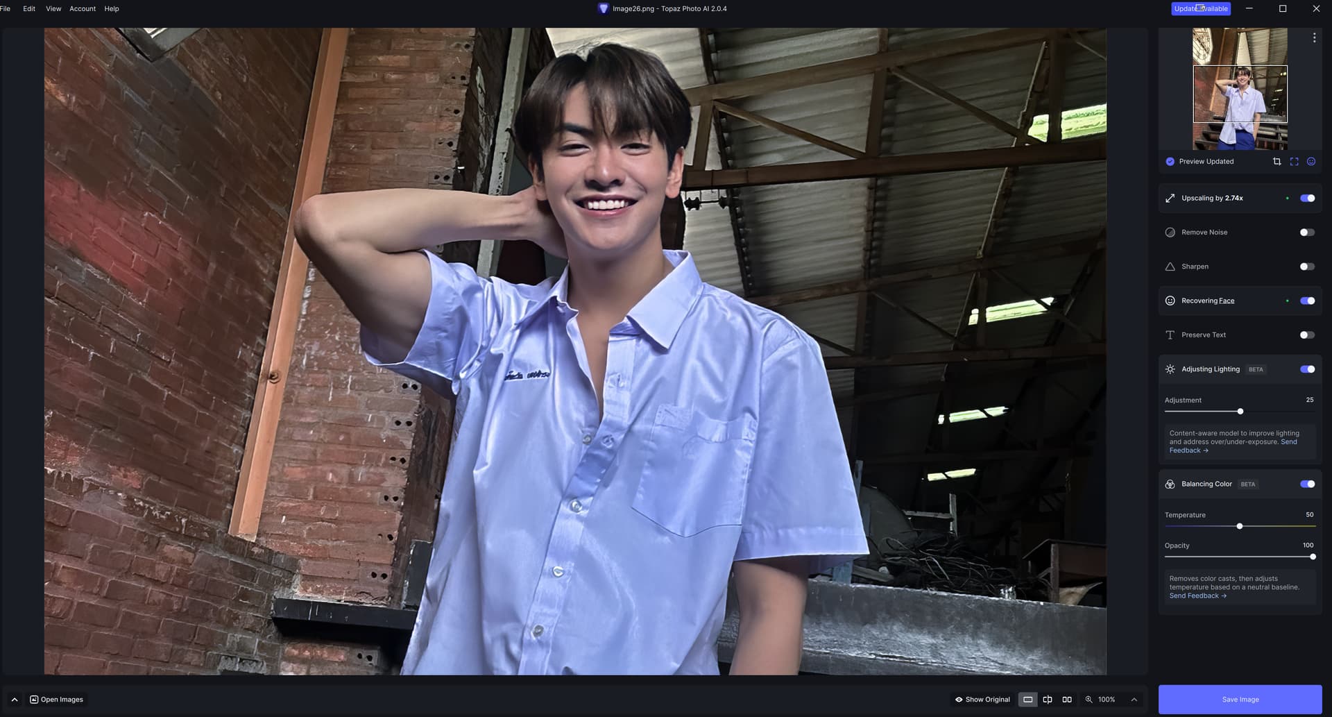
Using 2.0.4. Balance Color is pretty good at brining up some faint colors and increasing saturation. I usually am content with the results. However Adjust Lighting often makes my pictures too dark just because there are some hotspots. Get over it - shooting handheld, outside, with available light you’re gonna get some hotspots. Maybe it needs some masking capability or a slider to adjust how much it fiddles with the lighting.
1 Like
That sounds like a great idea! It would be an effective way to control where lighting changes are applied.
Okay, I just tried the Lighting again and it has been several updates later. It did a very good job and I am pleased. It is not perfect but way better then I expected keep going.
As there are some people shown on my sample image: where can I upload the image only for your private views?
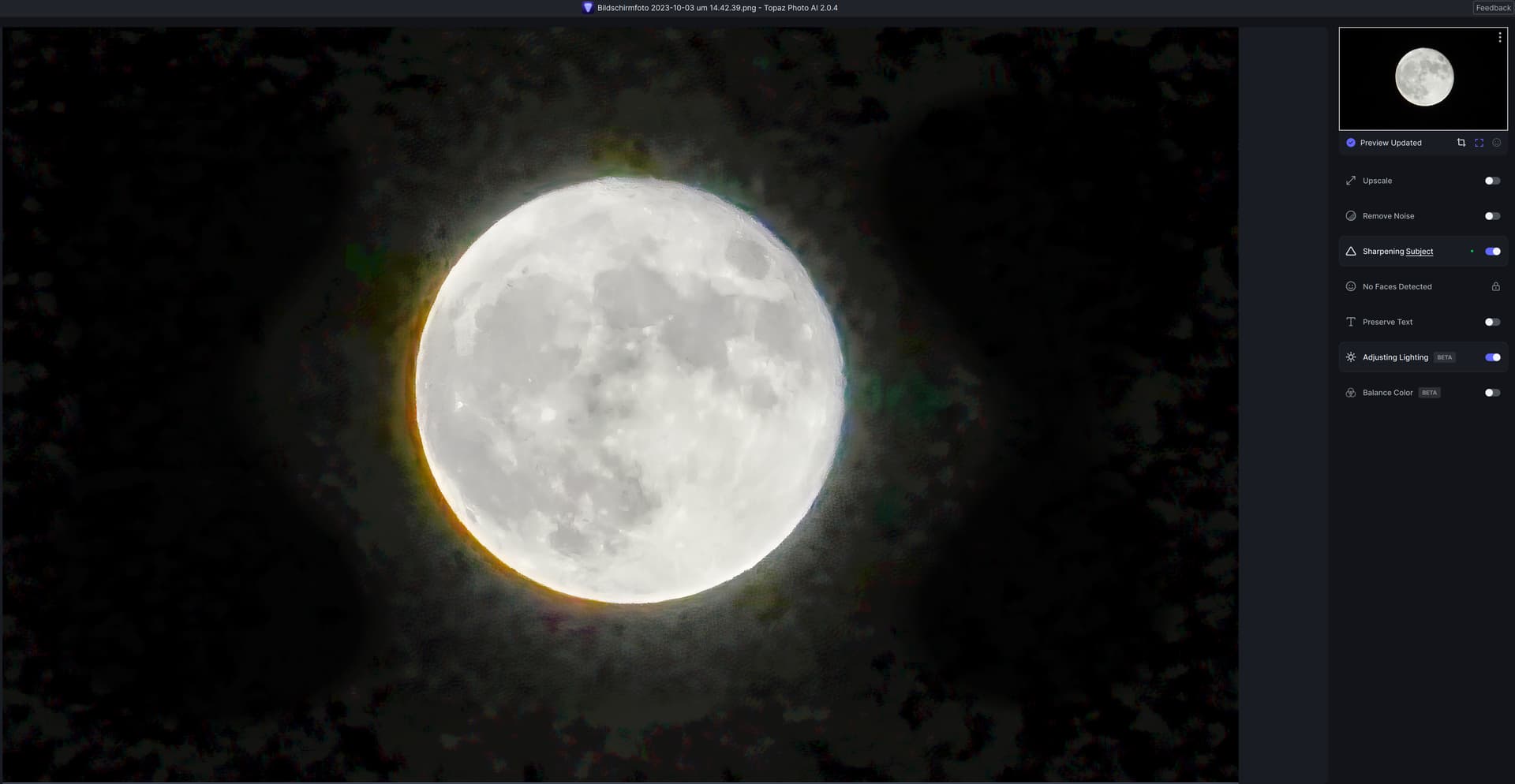
Adjust lighting still misbehaves with low-light photos in the Auto setting - cranking brightness up to insane amounts and thus creating heavy noise and artifacts as well as destroying the “night scene” look in quite some cases.
After enabling Adjust lighting:
2 Likes
Your example also shows it warmed the color when it shouldn’t have for that type of subject (in addition to the haze & noise).
If anything, a night scene should be cool hues unless you’re going for a surreal look.
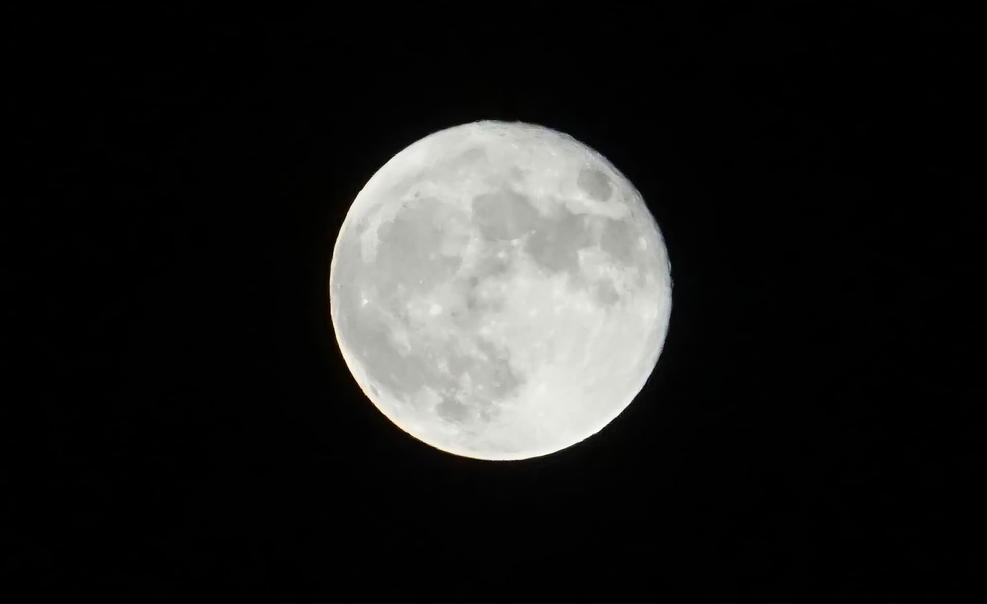
You did, however, produce better luminosity on the moon with the lighting adjustment. Inside the circumference of the moon you have a less muddy luminance…
1 Like
Why would you use Adjust Lighting on that image? It should only be used where necessary.
Well the moon is a bit overexposed and playing with brightness, contrast and black level you can optimize the details on the surface. Plus it was said that Adjust Lighting should become part of Autopilot (which I’m against).
1 Like
The Adjusting Lighting should be split into at (minimum) two toggle subcategories; Shadows & Highlights.
For example: Shadows would select the darkest pixels below an adjustable thresh hold, take those pixels and flatten the darkness. Using only the selected pixels original relative brightness from the darkest-dark to the lightest-dark, create a weighting mask where the AI generated lightest dark pixels would be fully expressed and the darkest dark pixel the least expressed. Do similar with Highlights. I think that would help create a pseudo-HDR.
Have it determine what the mid-tones are based off the subject’s face average skin brightness or from a user determined floating point.
As it it, the filter seems to darken the image indiscriminately. It’s like it’s trying to darken the image so the original’s relative darkness of the image is no longer as noticeable. I suppose, technically, the darkest pixels are not as dark when compared to the brightest pixels, but that’s just AI sophistry.
1 Like
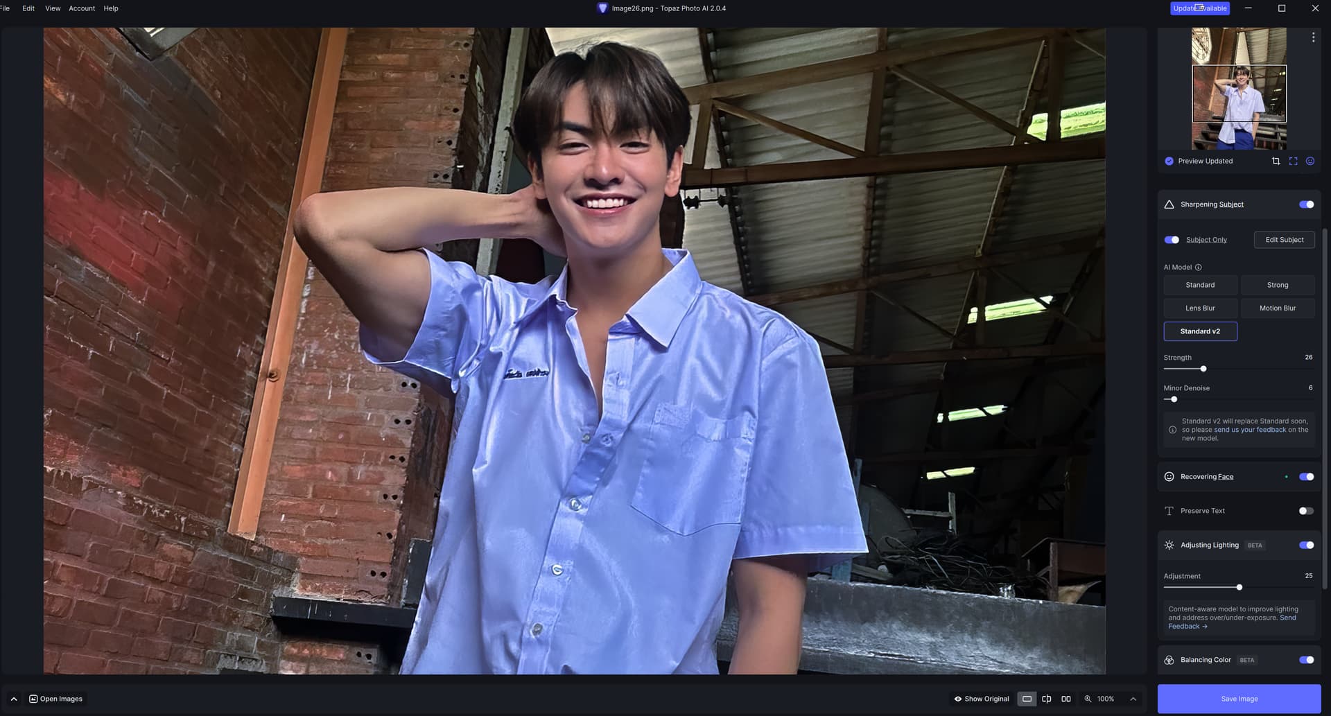
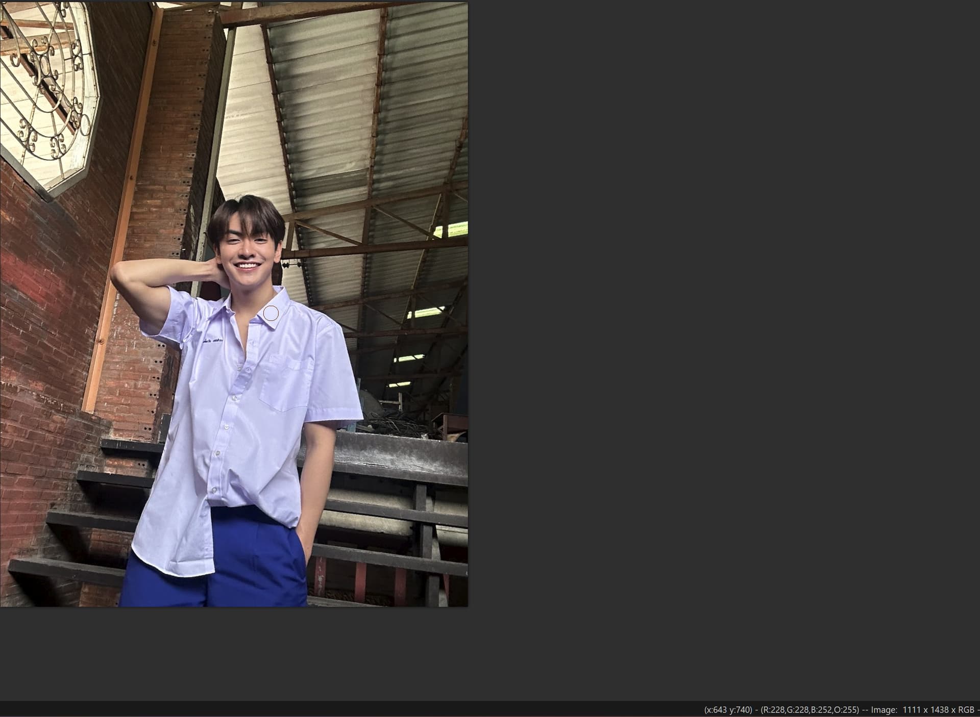
Interestingly enough, this mischaracterization of the color has happened twice today with similar material. The Shirt is WHITE.
Don’t understand how it’s happening. I use Datacolor Spyder X2 to calibrate all monitors.
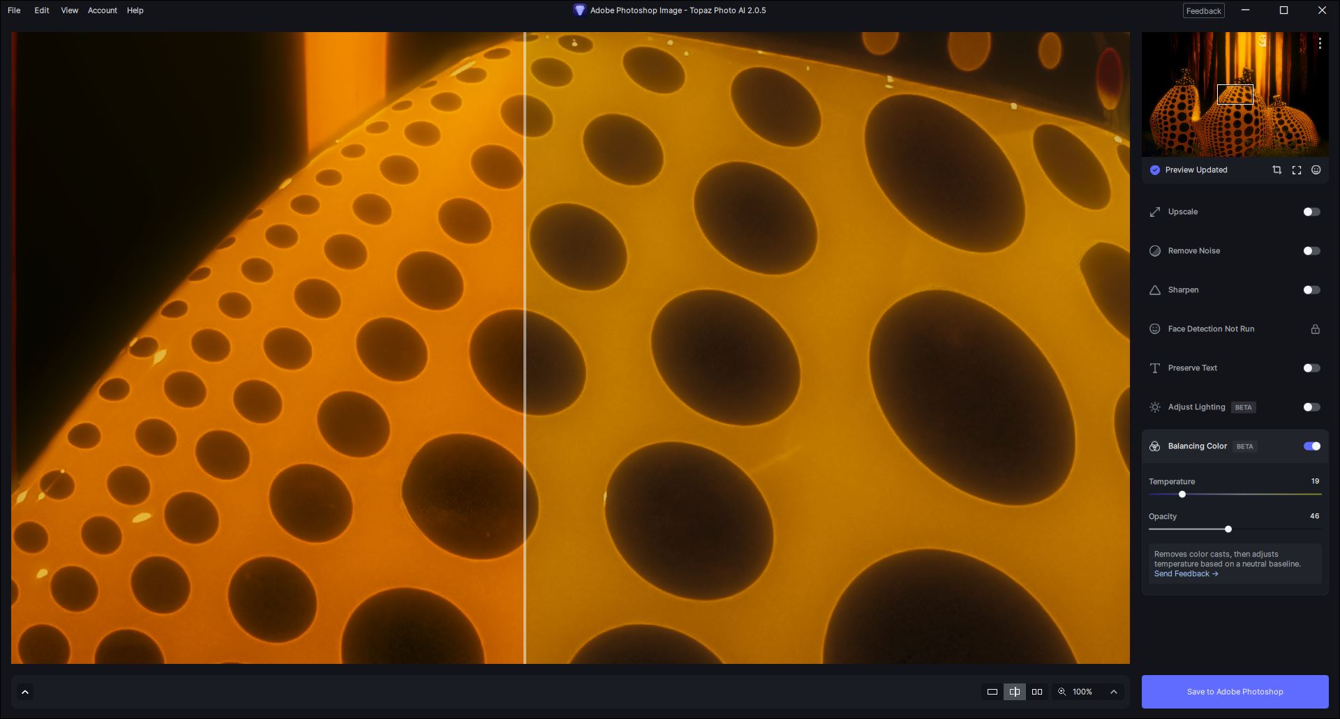
Just out of curiosity - because the settings for “Balancing Color” are chopped off in your snip above - where is your transform handle positioned on the color balance spectrum of cool to warm when the guy’s shirt changes from white to blue?
Here’s a snip from my UI…
1 Like
Oh. I had JUST enabled the balance. The color temp was centered. This is repeatable, though the blue isn’t as intense. Same monitor. Last full calibration was September 3rd.
This is the original shot. In RGB, it was already really “cool”.
2 Likes
Interesting!
It doesn’t look like the rest of the image is equally blue-colored.
What did you hope would happen to the pic by turning color balance on? (what did you want to achieve)
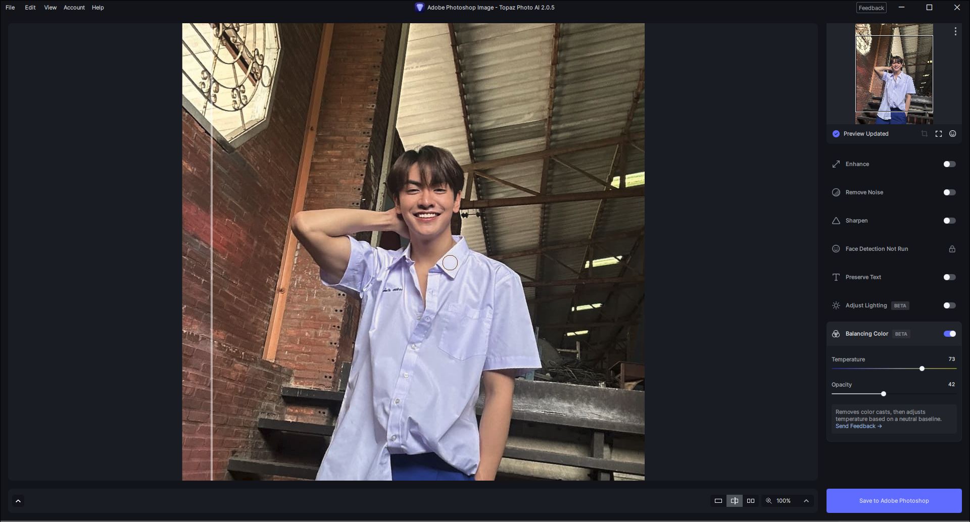
--------------I just downloaded & tried your orig. in my Ps 2024 PAI plugin.
A- I just turned on “Adjust Lighting” only (w/out Balancing Color activated). It definitely added a cooler, bluer hue. But not as dramatic as in your snip above. Seems to me that feature shouldn’t adjust hue or the saturation of hues. It should only brighten or darken tones…
B- Then I turned off “Adjust Lighting” & turned on “Balancing Color” with the Temp slider in the middle and Opacity at full power. Then I got the same kind of more intense blue on the shirt that you did. If I pull the Temp slider more into the warm range (~65) the shirt stays closer to the original color - but the person’s skin gets too warm and almost red.
C- When I move the Temp Slider more into the Warm range (73) and reduce the Opacity slider (in Color Bal) to about 40-42, it keeps the shirt closer to the original and warms up the subject’s skin somewhat w/out going overboard… If you want less warming of the shirt, the Temp slider should head a bit more left.
I assume you’re working with the PAI standalone. Is that so?
I have been blown away by some of the things this product can do. I’ve also reacted with “meh” on some of the things this product can do. To me, I believe it can only get better.
Coming back with a starkly blue-tinted shirt on an already “cool” image of a “white” shirt just enabling a feature surprised me. The fact that it was the 2nd image today to be treated this way, I posted.
I’m not unhappy in the least, but if something weird, consistent, and, in my opinion, not good happens, I’ll post about it.
I am now inundated with requests from friends and family, “Hey, can you fix this?” It’s fun, but I don’t let it interfere with work.
Thanks for asking.
Steve
Addendum: Oh no. I use PAI for shortcomings in the images. Then, I screen capture the image and work with it in Paint Shop Pro. For RAW, I use Capture One to get it to a lossless compression, likable image, and then move back to PSP.
Sounds like how they intend it to be used. I don’t work with Capture One (well, except for the stripped down Sony version…) but I hear ppl love it. Ditto I don’t use PSP, but several of the former beta testers did.
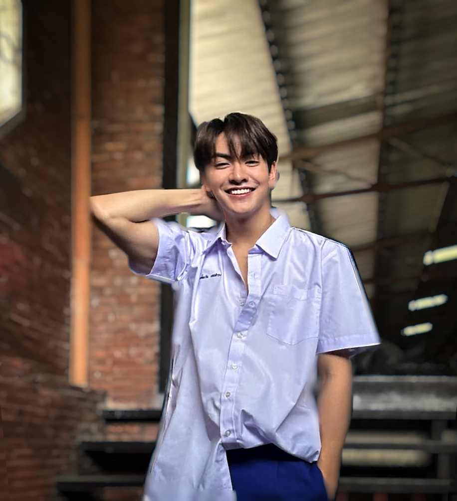
This is what I came up with just playing quickly (you can tell from the halo-ing and cruddy quality masking) in the way you described. Start with PAI, then noodle in Ps (I removed your subject, used generative fill to cover where he was, then adjusted the perspective of the bkground) and with the Boris Optics plugin to Ps (for some bokeh). Take care.
Now I remember reading this. I checked out the use of different “colorspaces” that some programs work in, like Adweebie 98 (wide-gamut), ProRGB (even wider), and sRGB (not so much). The posterization effect on the shirt can happen if an image from a wide-color gamut environment gets force-fed to the Internet, sRGB. That’s just what I’m thinking because I see this massive amount of whites blown-out in Internet images. I’ll have to do some more reading and mebe some labs.
1 Like
You’re probably right on the money.
I always shoot and process using Adobe RGB. When Topaz (& others) would convert images to a ProFoto (or other) colorspace it would radically change the appearance. When I used to post to Instagram (pre-Facebk, after them I stopped) I’d resize my images smaller and convert to sRGB for the Web. They’d definitely look different than what I saw when processing the originals! Usually darker. Even if I clicked to ‘embed profile’ when exporting for Web posting, it still changed the ‘look’ of my images somewhat.
You cannot shoot in AdobeRGB as a RAW file has no color space, this is the color space applied on creating a preview file for the RAW image.
A color space is a specific organization of colors in color profiling supported by various physical devices and reproduces representations of color.
Wide Gamut color spaces, CMYK, etc. are not suitable for displaying on the web or any application without color management. Conversion is the translation of the representation of a color from one basis to another. For example, wide gamut monitors, printers etc.
Here is an article you should read to understand color spaces and color management:
https://www.cambridgeincolour.com/tutorials/color-spaces.htm