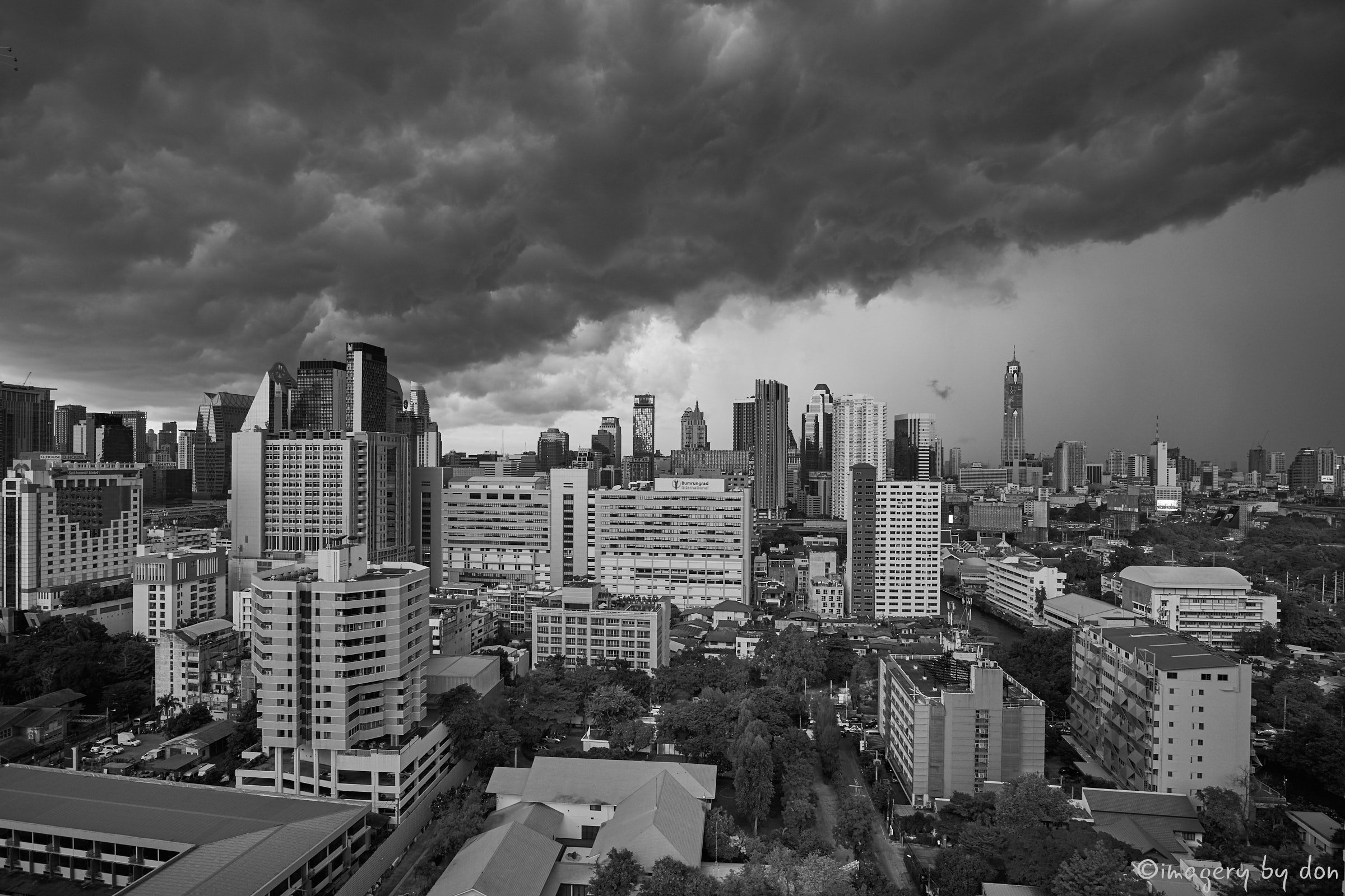
I think Peter asked for a B&W rendition of the image I posted last week, this is done by reducing Red, Yellow & Green sensitivity and increase Blue sensitivity… best viewed full size for the contrasts.
My tip for B&W is to get the image right in color first by balancing the Highlights, Midtones and Shadows then do a Color conversion as to get the balance right the luminosity is better viewed in color.