I am looking to Topaz users for opinions, please. I want to enter this in a photo show, but I am trying to decide between three versions. Help me choose… Thank you!! Version 1: Clarity, Adjust. 
Version 2: Clarity, Adjust and Texture Effects. 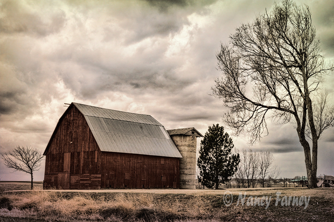
Version 3: Clarity and Adjust.

5 Likes
Its the third one for me, but could I suggest you straighten up the vertical of the building as I find the lean to the right a little distracting.
1 Like
I see that; thanks!
Three - Yup straighten a tad. Great image. Being from Michigan can certainly relate to this.
1 Like
yup straighten and then #3 for me too
I like the ‘moody’ look of #1.
2 Likes
I like Image 1 & 2… more 1 than 2 …but maybe mask in some of the results slightly from the barn siding and roof from image 2 into image 1?
3 Likes
Great idea, thank you!
1 Like
I’m originally from Iowa, so me too. ![]()
That’s the one I’m partial to also, I think.
1 Like
All are nice - the first one is the one I like best.
1 Like
Just for the sake of discussion, have you thought about B&W for this image?
1 Like
@CabanaBoy has a point there - just a little de-saturation and/or split tone on #1 or #2 might work OR a blend of B&W with one of those two images
1 Like
Very nice capture, agree with comments re need for vertical adjustment. I’m more to partial to #1.
1 Like
Thank you all for the suggestions! I was leaning (ha!) towards number 1 because of the moody effect. I straightened the barn. @CabanaBoy, you suggested black and white, thanks!  @cre8art, you suggested masking the texture effects onto the barn, and I tried that.
  @el48tel you suggested a split tone, which I really like, by the way.
2 Likes
glad you tried that - I’ve been experimenting recently with the hint of split tone … both on a colour image and on a B&W … it can give a different mood. Your new #1 and #3 have just such mood. I wish you well with it.
1 Like
