AI Adjust give nice clarity and detail enhancement.
For me however, color changes are all over the place! Most of the time it seems the AI got its education in a blue-green world and not consistently. So one can even create a preset to correct. What is worse, all the time the color shifting isn’t consistent as some times it will shift one color one direction and then shift another one in a different direction. Over-saturation is yet another issue and also is not consistent image to image or even colors within an image. So, I end up spending a lot of time correcting all the color issues that AI Adjust created and most of them can’t be fixed properly without going into Studio and using the HSL tool to fix individual colors.
Also, one issue/bug is if you want to tweak using the clarity tool, exposure jumps 0.1 to .2 higher and need to yet re-adjust that.
All in all, I have found this to be not even beta quality tool. The whole idea of an AI tool is to improve an image and decrease work. This is doing the exact opposite. I really did want this to work as there are a few things that are good but the bad just simply overwhelm anything useful. It was nice to provide Clarity and Detail owners with a free upgrade however, there are too many downsides to make this a useful tool.
I will go back to using my presets in Studio using Precision Contrast (Clarity), Precision Detail, and HSL tools which originally replaced Clarity and Detail.
I see a lot of the blue-green shifts in my images too. Certain scenes start off with an overall warm-mauve-ish tone and go completely blue-green, as you noted (so they’re going to essentially the complementary color in the photo light world). The result of Auto Std often doesn’t even resemble what was captured if I just want to tweak the details and not do a color ReMix on the overall shot.
I agree with you Fotomaker but I did a test and use the Standard AI setting and then only set the blue/yellow temperature to 0.45 (original RAW photo on left and Adjust on right) . As seen in this picture the color was then corrected so I think maybe the color temperature default is off. Maybe you can try that to see if you agree.
I didn’t look at the warmth slider number you used just to do an unbiased test. Okay, I just did after doing another test with my Orig image. Guess what! It was exactly at .45 where my image started to look better!!
That tells me two things:
1- The AUTO Standard algorithm should be adjusted by the Topaz developers so it produces a result that is 45% warmer than it is currently outputting/generating.
Unless there’s something about Win PCs that requires more incremental warmth/yellow than Mac’s. If that is the case, then a trained, intelligent software should be able to think something like… “If Mac then 0 (zero), If PC then .45” - for executing the steps/action/etc. to produce an Auto Standard image result.
2- Standard should not be called “Auto” if it requires a bunch of adjustments just to make an image look passable. To my silly way of thinking, auto means automatic and not needing human intervention. Someone should hit “auto” and when they see the result they should exclaim, “Voila! It’s perfecto! Time to post on Instagram and get my 2.5K Likes.”
I agree that the Auto setting should get it right and I think the color temp is being set wrong by the program (maybe a program bug). If Topaz corrects that the Auto AI should be pretty good. I used a silver car because it is easier to discern a color cast. Also, I made a preset using the Standard Auto setting with 0.45 yellow for now. My son has a 2019 Porche Panamera. Hello Topaz…
This was getting way off topic in the other thread about issues with Detail/OS-X please all note that RAW conversions are NOT supported but you can import a RAW image as they are working on the conversion issues.
I wrote all these comments in a different thread and responding to different issues.
My tested images were all JPGs. I don’t know how the heck my comments ended up over here on an irrelevant thread! They were in a thread that flowed logically from an original post to various replies by various users about the Auto Standard function in Adjust AI 1.0.3.
How did my comments end up in some unrelated raw discussion thread?
Here’s a sample of a Before/After using a shot of mine of an old Ford truck.
The After used Adjust AI 1.0.3 - Auto Standard option w/no other controls (AAI as plugin to Ps CC 2019 on Win 7 PC).
While there are clearly blue tones in the background on the original image, this AI interp has not done justice to the image or produced what I’d like & think was an ‘intelligent’ photo manipulation; it has just ‘gone nuts’ amping up the blue tones.
I agree that an AI engine should do better and not intro/make major color shifts. What would be ‘intelligent’ about a photo processing program producing a ‘standard’ image would include:
No color shifts
Recognizing a need for and adding a just right (Goldilocks-like) amount of contrast, exposure, opening of darker shadows, toning down of bright highlights, perhaps a touch of spreading out a ‘clumped up’ histogram
Perhaps adding a hint of Vibrance (not saturation)
Then if a user wants to get creative they can take that base, intelligently improved still straight image to the next level. Or, stop there with it as a “better” standard photo that makes the person who shot it look like they’re a really savvy photog. I’m sure the moral equivalent would hold for an illustrator or painter - but, selfishly, I’m a photog and am thinking about using the program for photographs.
I’ve seen this consistently with the Auto Standard button applied in AAI. It is jacking up blues as if on steroids and introducing blues (in other shots where there aren’t even any visible to most eyes) where they don’t exist.
Something is skewed blue in the program’s algorithm. Perhaps it is sad…
I think there is nothing wrong the software seems to perform a white balance adjustment based on areas the software identifies as neutral or close to neutral so the slight blue shift in your sample images is a correct logical adjustment.
The Adjust AI color temp needs correcting, the blue cast is not good. JLG, I choose the one on the right and I have excellent color vision (and a calibrated monitor).
The time between the third beta version and production release of TAI was less than one week (v.0.1,v.0.2 was not much longer). Compared to the beta release cycle of (eg) Affinity Photo they are light years apart.
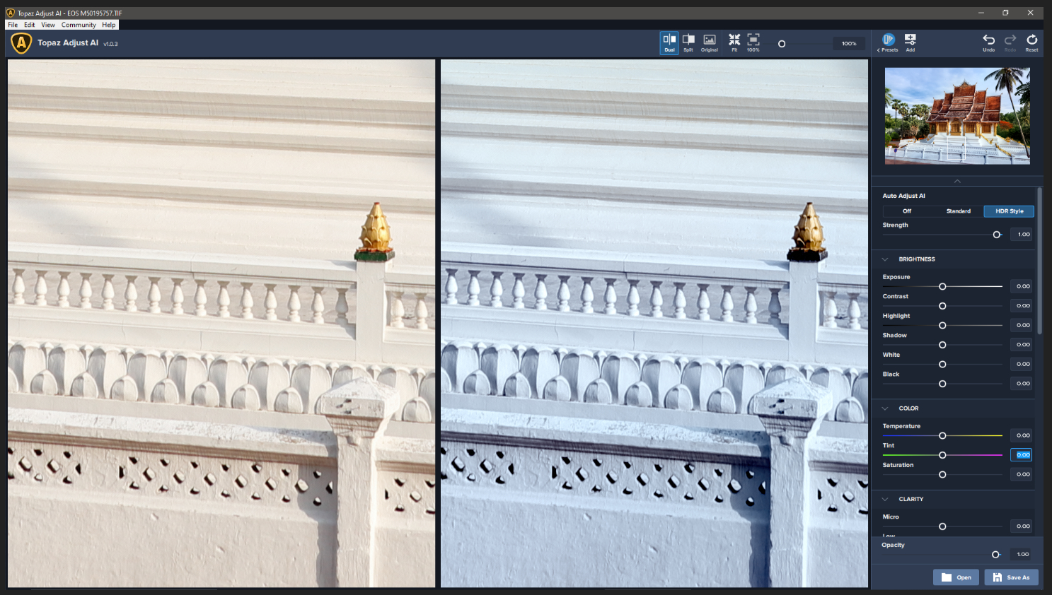
It does seem to over compensate when using the Auto Adjust AI almost as though anything that is close to neutral colors is treated as a ‘sky’ scene and it is trying to extract detail and color from the ‘white’ areas. For the first screenshot it is the Standard process, which is acceptable but the second using the HDR Style process is unacceptable as you can see from the white areas:
Also found that looking at a landscape style image, in this case a waterfall shot, it seems to improve the ‘warm’ colors correctly but struggles with larger areas of unbroken green. This particular image, using Standard, is acceptable as it brings out a blueish tinge in the deeper water areas (the water is actually cloudy green) but with the HDR Style it is way off but the warm tones are not excessive:
well seems I was wrong. I have not played with auto adjustments for many years for a good reason and as it seems adding AI does not really improve things. AAI does wired and undesired things to colors far beyond color shifts which are also not correctible inside the plugin. the HDR setting more than the standard but both alter the color checker shot as your real world samples in an undesired direction. white balance did not influence the outcome very much btw.
CS, using a color checker is a good idea. To me the most noticeable difference is with the case which has a blue tint (though I can see it some in the white). I assume that the top picture is original vs Standard auto AI and the second one is original vs auto HDR AI? Also no other adjustment was made ti either?
artisan-west - right, the first is std. the other HDR. did play with some real images too all show the same strange color shifts shift. only when an image is already very warm the software emphasis the warm tones otherwise everything is shifted to blue…
I calibrate my monitor every 2 weeks with a Spyder calibration device in a darkened room with a warmed up monitor. That is what I’m seeing photo colors on. I’m not in a pitch black room when photo processing but I definitely don’t have any serious ambient light and I have an ambient light-blocking screen around my monitor.
I find the color shifts considerably more off in Auto Standard than in Auto HDR on my Win 7 system (regardless of standalone or plugin program - but I mostly use as plugin to Ps CC 2019). I’ve had overall flesh-hued images (like in a deserted Phila jail hallway, so not skintones per se) turn a muddy seafoam blue using the Auto Standard setting in AAI 1.0.3 (and earlier beta versions… reported at the time).